Multimedia artist Faith Ringgold passed away on April 12, 2024. She was 93 years old and renowned for depicting the African American experience often using pictorial quilts.
During the 1960s and 1970s Ringgold played an instrumental role in the organization of protests against museums that had neglected the work of women and people of color. In 1971 she was a founder of the artist collective for Black women, Where We At. Ringgold was also an author and illustrator of children’s books. It is through one of her books that she first came to my attention.
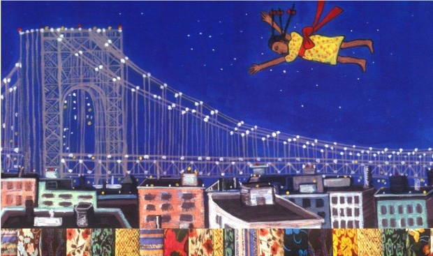
During the early 1990’s my sister was working on her bachelor’s degree in childhood education and one day wanted to fervently show me one of the children’s books she was reading. It was Tar Beach. Set in the Harlem of 1939, it tells the story of Cassie who dreams of being free and going anywhere she wants. One day her wish comes true when the stars help her to fly across the New York City. I was immediately taken with the book because the George Washington Bridge was prominently featured. I grew up near that bridge and spent many magnificent summers biking and walking across. My sister knew of my love for the bridge. However, I was also intrigued to learn the book had started out as a story quilt.
Ringgold, in 1988, created a story quilt titled Woman on a Bridge #1 of 5: Tar Beach, which was part of a series, Women on a Bridge, that depicted women, “…actually flying; they are just free, totally. They take their liberation by confronting this huge masculine icon—the bridge.” A few weeks before my sister shared Tar Beach with me, I had serendipitously read Alice Walker’s short story, Everyday Use, for my American Literature class.
Everyday Use is set during the late 1960s or early 1970s in the rural south and tells the story of a family reunion where the characters contend with their opposing perspectives on their cultural roots and the meaning of heritage. Is heritage best represented by everyday use or by historical display of objects[1]? The story examines these ideas through quilts, an African American tradition that are a vibrant part of American history.
Enslaved women first created quilts communally out of a necessity to supplement their scarce bedding. Members of the Underground Railroad used quilts to send messages: quilts made with black cloth were hung to mark a safe house of refuge, while other quilts acted as maps, marking escape routes. Quilts also recorded family events such as births, weddings, and geographic locations. Meaningfully, quilting served as a creative outlet for the women to claim their identity and legacy during a time when literacy was illegal for them. I think this is exactly what Ringgold and Walker were connecting with in their own art. And Ringgold successfully does both of what Walker explored in her story: heritage through display and “everyday use.”
Tar Beach and Everyday Use will forever be linked for me: I can’t think of one without thinking of the other. I also can’t help but to also think about how both, whether through words or illustrations, tap into the importance and connection of the handmade and heritage.
In this increasingly exhaustive era of digitizing, monetizing, branding, and gentrifying, the cultivation and maintenance of heritage is becoming more difficult. Just last week I saw several stories about how some colonizing Americans moved to Mexico and are trying to suppress local customs. Similar things are happening in Puerto Rico, and be sure to read the chapter on Harlem in the book, Vanishing New York.
The transmission of customs from generation to generation are essential to any group’s identity as well as to foster heritage. For it to flourish, it must indeed be a part of “everyday use.”
Thank you, Faith Ringgold, for cultivating heritage and fostering my own imagination with your beautifully empathetic art. Enjoy your own flight among the stars over New York City.
“An Evolution of Expression.” National Museum of African American History and Culture, 17 Nov. 2023, nmaahc.si.edu/explore/stories/evolution-expression.
“Through the Folk Art of Quilting, Tracy Vaughn-Manly Works to Preserve Black American History and Culture.” Weinberg College News, 14 Feb. 2023, news.weinberg.northwestern.edu/2023/02/14/tracy-vaughn-manly-works-to-preserve-quilting-history-at-northwestern/.
Bryant, Marie Claire. “Underground Railroad Quilt Codes: What We Know, What We Believe, and What Inspires Us.” Smithsonian Center for Folklife and Cultural Heritage, 3 May 2019, folklife.si.edu/magazine/underground-railroad-quilt-codes.
[1] One of the first exhibitions at El Museo Del Barrio was The Art of Needlework which showcased the artistry of Puerto Rican women—the display of everyday use if you will. What started out as a local custom was then gentrified, monetized, and eventually abandoned with the advent of machinery. This exhibition happened about three years before Alice Walker published Everyday Use.
Designing a logo requires significant thought and strategy. A museum logo design should not just convey an acronym, it should evoke a message. Positive and negative space is a classic design trick that plays a key role in conveying messages and could be mixed with typographic fonts to create a logo. Modern museum logos are focused on adapting modern perspectives. Vibrant, modern logos for museums usually focus more on shapes and silhouettes. Museum logos should incorporate an understated touch of the old and new.
The Asian Art Museum in San Francisco launched a new logo in 2011 that was created by Wolff Olins. The old logo, which was created in the early 1990s, took the form of a solid red square bearing the word “ASIA” in dropped-out white, bolstered by a stylized red “N.” The red block recalled the signature seal that appears at the margins of many East Asian painting and calligraphy scrolls (Kobayashi 2012). Tim Hallman, director of communications and business development, told the SFGATE.com (San Francisco Chronicle’s digital presence), that in place of the old logo, “we wanted something bold that didn’t suggest an institution just representing the past.” The current logo consists of an upside-down letter A. When the inverted “A” was presented, a board member’s spouse pointed that as a mathematical symbol an inverted “A” represents “for all.” “We decided we were on to something,” Hallman noted. (Baker 2012)
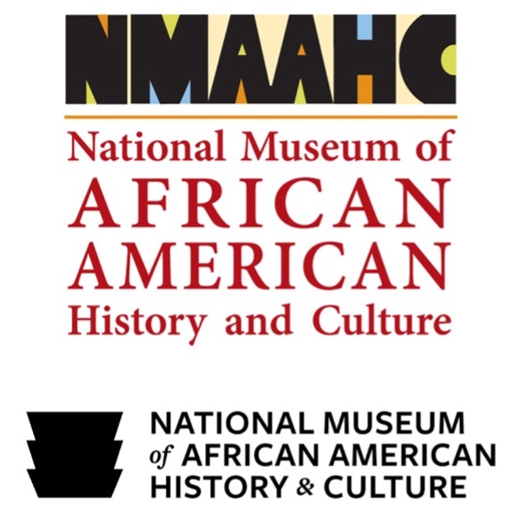
Here we have an early iteration of the NMAAHC’s logo (or a working logo) and the current logo. The working logo has quite a few problems: it is over complicated, too colorful, has poor spacing, and the two typefaces do not complement one another. Interestingly, some of those colors survived and can be seen in the NMAAHC’s current brand guide (National Museum of African American History & Culture n.d.). Meanwhile, the current logo (this is the horizontal iteration) is nothing short of excellent. Aside from highlighting the building’s distinction on the National Mall, it can stand alone and work without text and be instantly as recognizable as the Nike swoosh. Interestingly, they also retained the use of serif and sans-serif typefaces with the latter dominating the design. The museum has a long name and even its abbreviation is long (which, of course, cannot be helped). But note that from the working logo to the current one, they dropped the word “and” and substituted it with an ampersand. Time will tell if a catchy nickname emerges.
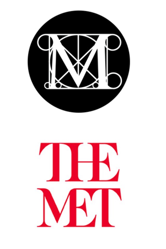
The Metropolitan Museum of Art is the largest art museum in the United States with two locations in New York City and is commonly known all over the world by its nickname, The Met. The museum decided to capitalize on this when they created a new logo 2013. The previous logo, a classically diagrammed M clearly influenced by western art, had been in use since 1971. One of the reasons for the new logo was to give the then three sites a unified image (at the time the locations included the main museum on 5th Avenue, The Met Breuer, devoted to modern art, which closed in 2020, and The Met Cloisters devoted to medieval art and located in upper Manhattan), not unlike what The Tate did with regards to creating a unifying visual identity for the Tate Britain, Tate Modern, Tate St. Ives, and Tate Liverpool. The logo, like the Asian Art Museum in San Francisco logo redesign in 2011, as well as The Tate redesign, was created by Wolff Olins.
Justin Davidson, New York magazine’s architecture critic called the logo a “graphic misfire” that “looks like a red double-decker bus that has stopped short, shoving the passengers into each other’s backs.” Davidson goes on to note: “You might think an art museum that attracted 6.3 million visitors last year might not worry much about coming off as too aloof. Or that those who feel intimidated by ceremonial staircases and neoclassical colonnades might not be soothed by a logo with stylized ax blades hanging off the E and T. Or that it might seem a little childish to grab back a nickname already embedded in the logo of another Met. (The designer Paula Scher broke the word Met / ropolitan before Opera specifically to highlight the shorthand.)” (Davidson 2016)
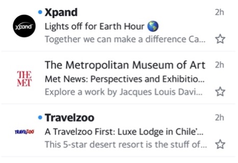
I wholeheartedly disagree with Davidson. First and foremost, The Met isn’t solely about western art. The old logo, which immediately recalls Leonardo da Vinci’s Vitruvian Man drawing, implies that. The new logo brilliantly combines calligraphical and sans serif typeface elements (the old and the new) that connects the past with the present as well as the future. Davidson also fails to realize that the original logo was created in a pre-digital world. To the right is a screen shot from my iPhone of an e-mail I recently received from The Met. One can see how easy it is to spot and pick out the museum’s logo in between the Xpand logo, which would be more legible at this size if they used a white background, and the Travelzoo logo, which is nearly illegible. One important thing about any modern logo is its need to be scalable—it should look great whether it is big or small and, most importantly, should be easy to read and stand out whether it is at the top of a letterhead or at the bottom of a 96-sheet billboard. Finally, I would like to note that if one went to the top search engines (Google, Yahoo, and Bing) and typed “The Met” the first thing that comes up is The Metropolitan Museum of Art and not The Metropolitan Opera, which is always the second listing.
Typeface Survey
In 1448, Johannes Gutenberg, a goldsmith living in Mainz, Germany, was experimenting with a mold with the goal of speeding up the process of putting ink on paper. Gutenberg’s invention, the printing press, fostered the modern world of science and industry. Printing took off in large part because Gutenberg could produce, using movable type, a book that looked as if it had been written by hand. (Sington 2020) This was possible because he was printing the Latin alphabet. The letters of the Latin alphabet are simple, block shapes and all the letters are clearly separate and can easily become blocks of metal to be printed (Shaw 2015). Had Gutenberg been trying to print a type of script, he might not have succeeded. Every modern innovation is built on the technology of putting words on a page. (Sington 2020)
Since the advent of the printing press, there would be variations and advances in printing that include etching, lithography, mimeograph, screen printing, phototypesetting, inkjet printing, and laser printing. With the arrival of desktop publishing, the words typeface and font became common and are often used interchangeably. On a technical level both words have distinct meanings. The word font comes from the Middle French word ‘fonte’, which means cast in metal. Printers like Gutenberg would cast complete sets of metal letters to make up a font. Fonts with a common design made up a typeface. In a box containing a specific font were two cases – one for capital letters and one for small letters (which is where upper and lower cases comes from). Blocks of text were assembled letter by letter to form a page layout, which was then rolled with ink and pressed onto paper to make prints. (Webster 2019) In modern terms, typeface describes a style and way of presenting text, while a font refers to variations of a typeface, such as size and weight. Helvetica is a typeface that has a complete set of characters with common design characteristics. However, it is made up of a whole collection of fonts, each in a specific weight, style, and size, with different levels of concentration as well as italic versions.
Typography is an essential element in graphic design, and therefore a significant part of branding. Typography represents the tone and values of a brand not unlike the way color represents a feeling. Typefaces can be classified into the following three groups: serifs, sans-serifs, and scripts. Generally, serif typefaces represent classical tradition, authoritativeness, and trustworthy. The Times New Roman font, originally designed in 1932 for The Times of London newspaper (Microsoft 2021), is a widely used example. Sans serif typefaces typically look clean, modern, and universal. Helvetica is widely used in signage because of its high legibility and simple feel (the exact one used in the New York City subway redesign example noted earlier in this paper). Script typefaces, designed to look like cursive handwriting, look more personal and are often associated with creativity.
Typefaces have changed and evolved over different periods of time, following trends, technology, and art movements. When thinking about typography and design, all typographic elements should consider visual arrangement, color contrast, the blank space, as well as sizes. Every typographic element impacts design on both the macro and micro level. In museums, most notably with exhibition labels, the legibility of copy is important. Museum labels are indeed subject to brand standards.
Good legibility is largely influenced by familiarity. There are many typefaces to choose from that offer excellent legibility for the body copy of museum labels. However, it should be noted that redesigning typefaces created for traditional methods of printing and then translated for computer bitmaps can change the aesthetics. The qualities of a good brand typeface are legibility, uniqueness, and being able to work for various platforms and mediums while conveying a distinct personality.
Choosing the right typeface can make a significant difference between a good and a great design. Even though most computers come with a library of typefaces, this isn’t always enough as a designer might be looking for a particular look and feel. There are several websites with massive libraries to browse through. These sites are broken into three types, giving you the option between open source / free, paid, or a subscription. Open source typography is easy to find and experiment with and are often the choice of startups and small businesses. Typography found on sites such as Google Fonts is web-friendly and consistent across all platforms and devices. The downside is that they are often generic and lacking in character and don’t add much to a brand. When you pay for typefaces, you are ensured a greater degree of flexibility and uniqueness of personality. Options are indeed more numerous, but licensing for these can be costly. The best way to truly make a statement and get a typeface that is a perfect reflection of the brand is to create one. Custom typography provides a unique visual language, but it can be quite expensive. Creating primary, secondary, and tertiary font types is also very time-consuming.
The Cooper Hewitt in New York City is the only museum in the United States devoted exclusively to design. Founded in 1897 by the Cooper/Hewitt family as part of the Cooper Union for the Advancement of the Science and Art, it became a part of the Smithsonian in 1967. In 2014, The Cooper Hewitt rebranded. Like The Met, part of their rebranding included adapting their shortened nickname “Cooper Hewitt” (previously known as Cooper-Hewitt, National Design Museum, Smithsonian Institution) The rebranding also included a tailor-made typeface known as “Cooper Hewitt.” Smithsonian Magazine noted that “…the new typeface is strong, simple and versatile, making it “clear for signage, compact for print” and optimized for digital media.” The Cooper Hewitt typeface is an open licensed font free for anyone to download, use, or modify on their own. (Stamp 2014)
Color Survey
Color is a significant factor in branding. Interestingly, color does not exist in the physical world, only light waves of various wavelengths that are received and distinguished within the eye and brain. Although humans can distinguish between numerous wavelengths, our color vocabulary is limited. (Smithsonian Libraries 2017) Color perception has long been the subject of experiments and discussions. Perception of color can change based on a person’s age, gender, personality, income, and other factors. Considering the factor of age as one example, the North Carolina State University Color Lab notes that “the human body undergoes change as it ages and this includes changes in the optical apparatus and pertinent sectors dealing with the construction of retinal image. Variations in the macular pigment in different eyes as we age also contribute to the overall color vision variability amongst humans.” (North Carolina State University Color Science Lab n.d.)
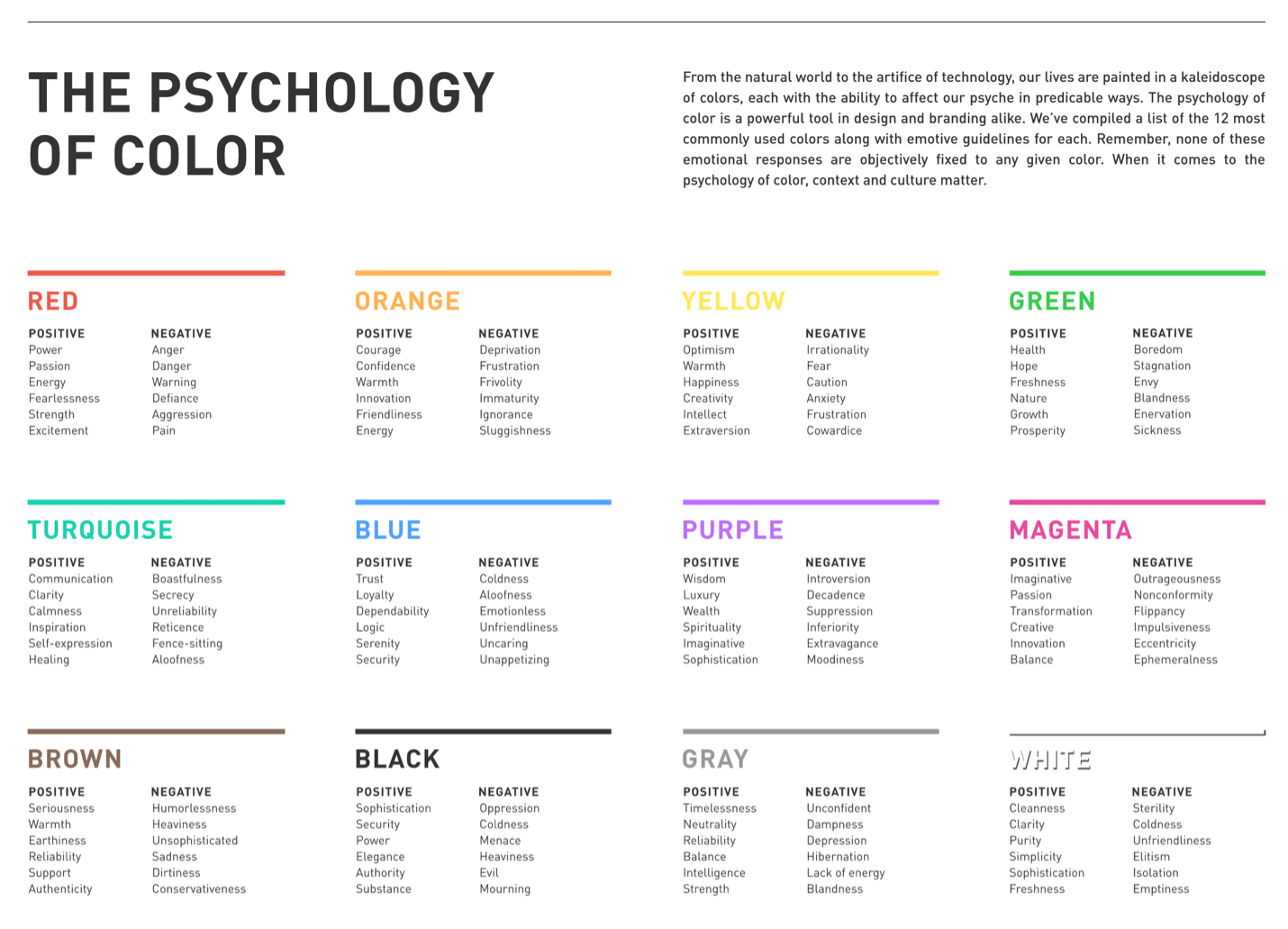
The psychology of color is a powerful tool in design and branding. According to a 2006 study, “Color is ubiquitous and is a source of information. People make up their minds within 90 seconds of their initial interactions with either people or products. About 62‐90 percent of the assessment is based on colors alone. So, prudent use of colors can contribute not only to differentiating products from competitors, but also to influencing moods and feelings – positively or negatively.” (Singh 2006) The Color Psychology Chart offers a brief look at twelve of the most used colors along with affecting guidelines, both positive and negative. (Ignyte Branding n.d.)
Adobe Marketo Engage analyzed the world’s top 100 brands to explore the most popular uses of colors. They found that blue was used in 33% of the top 100 brands. Red was used in 29% and black or greyscale was the third most popular choice with 28%. Finally, 13% used yellow or gold. They also noted that 95% of the top 100 brands only use one or two colors to maintain consistency by staying simple in their branding. (Solar 2018) As I noted earlier with the logo for the National Museum of African American History and Culture, the recognizable corona does not need the text to be effective.
The Craft Contemporary art museum (previously known as the Craft and Folk Art Museum) located in Los Angeles was established in 1975 to exhibit the work of underprivileged craftsmen and artists while promoting contemporary art made from local craft processes. The design firm, Siegel+Gale, discussed the name change: “The name Craft & Folk Art Museum was setting the wrong expectations. Together, the words “Craft” and “Folk” sounded ordinary and traditional, rather than rich and relevant. The name did little to pique the interest of visitors looking for a more contemporary museum experience. And it failed to highlight what makes the museum so unique: it functions as a platform for a diverse community of makers and as a space to both view and create art. The museum needed a more engaging introduction, one that appealed to a broader audience and worked to elevate craft in the contemporary art dialogue.” (Duong 2019)
As part of the overall rebranding, Siegel+Gale also redesigned the museum’s logo which is a simple sans-serif typeface with an edgy monogram. The simple, but consequential typeface was created to emphasize the letter C in the museum’s name. Note the orange color: as detailed in the Psychology of Color Chart, it has positive associations with the innovation, friendliness, and energy. Orange conveys the excitement of red, while concurrently conveying the warm aspects of yellow.
Siegel+Gale noted that the monogram that communicates, through the bold geometric shapes, a diverse community that believes in the distribution of contemporary art and culture. A bold, forward-looking triangle within the negative space was incorporated to represent progression and the pushing of boundaries.
Alexander, Edward P. , Mary Alexander, and Juilee Decker. 2017. Museums in Motion: An Introduction to The History and Functions of Museums. London: Rowman & Littlefield.
Beveridge, William I.B. 1957. The Art of Scientific Investigation . New York City: W.W. Norton & Company Inc.
Blattberg, Robert C., and Cynthia J. Broderick. 1992. “Marketing of Art Museums.” In The Economics of Art Museums, by Martin S. Feldstein, 327 – 346. Chicago: University of Chicago Press.
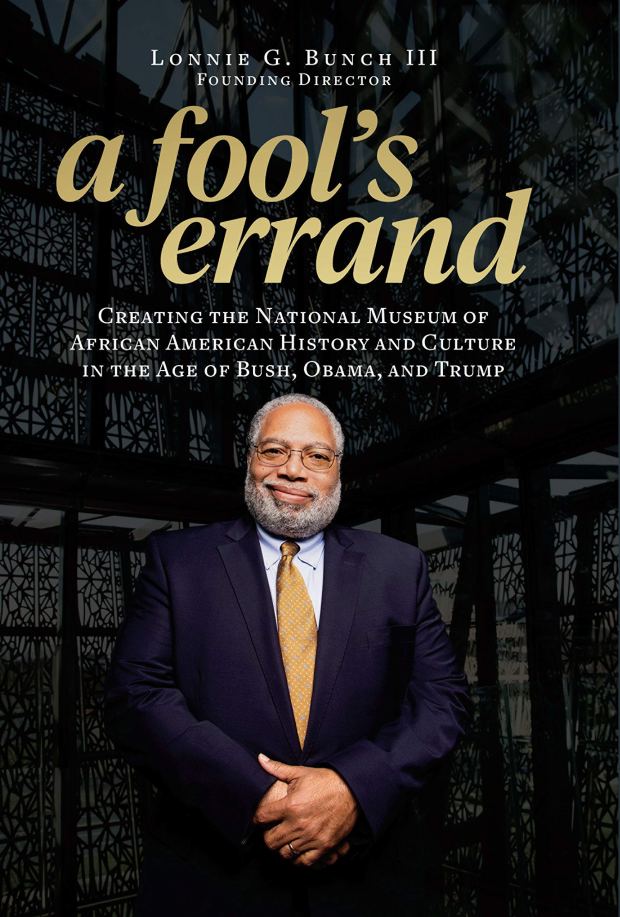
Bunch, Lonnie G. 2019. A Fool’s Errand: Creating the National Museum of African American History and Culture in the Age of Bush, Obama, and Trump. Washington, D.C.: Smithsonian Books.
Carr, David. 1999. “The Need for the Museum.” Museum News 31-57.
Kobayashi, Sachie. 2012. “Description of East Asian Seal Impressions as Metadata.” Journal of East Asian Libraries.
Mann, Jorrit. 2021. Dieter Rams: Ten Principles for Good Design. Munich: Prestel Art.
McCall, Vikki, and Clive Gray. 2014. “Museums and the ‘New Museology’: Theory, Practice and Organizational Change.” Museum Management and Curatorship 29 (1): 19-35.
Ross, Max. 2004. “Interpreting the New Museology.” Museum and Society (2): 84-103.
Schubert., Karsten. 2000. The Curator’s Egg : the Evolution of the Museum Concept from the French Revolution to the Present Day. L. London.: One-Off Press.
Shaw, Paul. 2015. The Eternal Letter: Two Millennia of the Classical Roman Capital (Codex Studies in Letterforms). Edited by Paul Shaw and Scott-Martin Kosofsky. Cambridge, Massachusetts: The MIT Press.
Singh, Satyendra. 2006. “Impact of color on marketing.” Mangement Decision (Emerald Group Publishing Limited) 44 (6): 783-789.
2020. A to Z: How Writing Changed the World. Directed by David Sington.
Smithsonian Institution Office of Policy & Analysis. 2001. Audience Building: Marketing Art Museums. Washington D.C.: Smithsonian Institution.
BOOK REVIEW: A FOOL’S ERRAND: CREATING THE NATIONAL MUSEUM OF AFRICAN AMERICAN HISTORY AND CULTURE IN THE AGE OF BUSH, OBAMA, AND TRUMP
“One can tell a great deal about a country by what it remembers. By what graces the wall if its museums.” – Lonnie G. Bunch III
The day I finished reading A Fool’s Errand: Creating the National Museum of African American History and Culture in the Age of Bush, Obama, and Trump by Lonnie G. Bunch III, founding director of the Smithsonian’s National Museum of African American History and Culture (NMAAHC), I learned that a school board in Tennessee banned the teaching of the holocaust graphic novelMaus and a House committee in Florida passed a bill aiming to ban discussions of sexual orientation and gender identity in schools. Throughout A Fool’s Errand Bunch notes the friendship he formed with Emmett Till’s mother, Mamie Till-Mobley, and I couldn’t help but to think of the marker outside of Glendora, Mississippi, where Emmett Till’s body was found in 1955. Until 2008, the spot remained unmarked, but when a memorial was erected, it was vandalized four times. The most recent iteration of the memorial, erected in 2019, had to literally be bulletproofed. The parallels to the Till Memorial and the obstacles Bunch faced and the overall history of the museum’s founding are palpable. Bunch notes that efforts to launch this museum started a century prior, and were still being stifled as recent as the 1990s by the likes of Jesse Helms. Silencing the voices of history is bigotry’s fundamental move toward enacting racism.
A Fool’s Errand is framed by three presidents. First, there was George W. Bush, who wholeheartedly endorsed the project and signed the legislation to get it started. Bunch formed a friendship with George and Laura Bush and portrays them rather positively. While he acknowledges Hurricane Katrina, he does so, in my opinion, with a rather light touch. Second was Barack Obama, who had the honor of officially opening the museum. Bunch compares his philosophy of the museum to the way Obama approached his presidency: the museum is an American museum for all Americans and not just African Americans. The story of African Americans is the story of America. And finally, Trump. Bunch describes giving him a private tour, which he rightfully did not bowdlerize as he had been asked to (because Trump had been in a bad mood that day) and noted that Trump did not acknowledge the Dutch role in the African slave trade but conveyed that the people of the Netherlands “love him.” Right on brand. Bunch describes how during the first months of Trump’s administration a noose had been found in front of an exhibition case that contained artifacts of the Ku Klux Klan in the 1920s. As I read the last two chapters, I couldn’t help but wonder if the museum would have opened when it did had Bunch not been so determined in his vision and execution. He worked hard to make this museum “for the next century and not the last one” happen. The politics surrounding this museum is nearly breathtaking but not unexpected.
The book is indeed a template for creating a museum from nothing, but what makes it so incredibly relatable is its humanity. Bunch is an excellent listener and observer and can easily connect with the elite as well as everyday people. For me, it was his interactions with everyday people that stood out. There was Princy Jenkins who had once lived in a slave cabin with his enslaved grandmother; the people he met during Save Our African American Treasures; and Dr. Charles Blockson who donated previously unknown artifacts that belonged to Harriet Tubman. Blockson lovingly donated those items and like many after him, wanted to contribute to the museum without any monetary gain (“This belongs in a place where the public can enjoy the collections. It is yours.”) Perhaps the most moving story was when Bunch met an elderly woman who had an unknown artifact from his own family.
I recommend you read this touching book with an open mind and a very open heart. If you enjoy storytelling and history, you will find a great deal to enjoy in this book. For me, the book inspired a self-reflection of the last two decades. Could I have done better? Can I still do better? I hope so.
“Learn the rules like a pro, so you can break them like an artist.” -Pablo Picasso
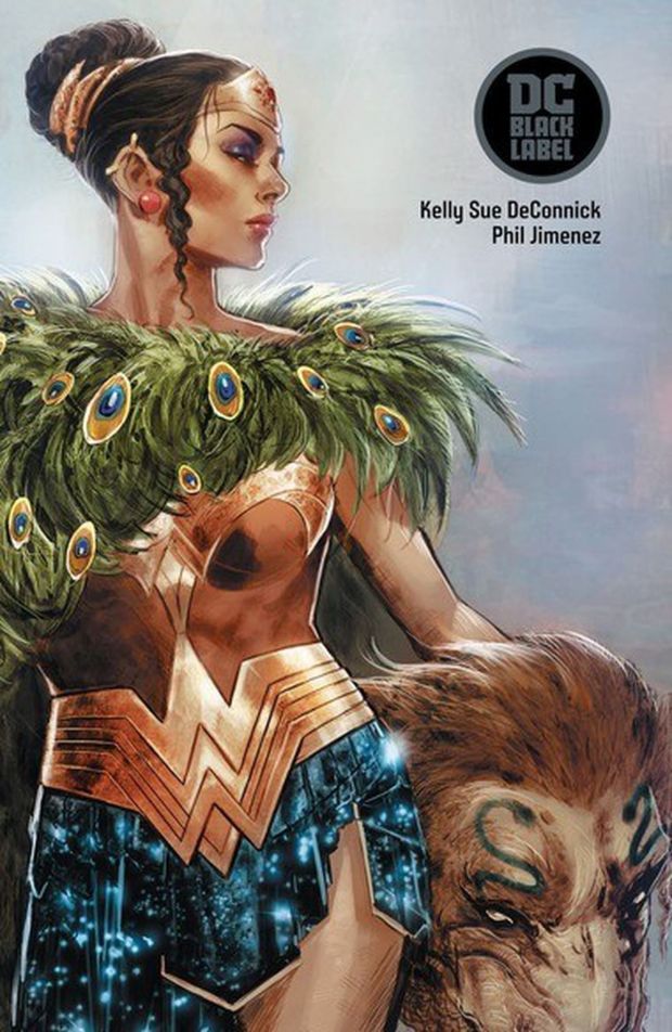
Pop culture is exactly that: culture that is popular, easy to understand and entertaining. High culture, on the other hand, is more sophisticated and challenging. I love when pop culture meets high culture. This is exactly what we have in Wonder Woman Historia: The Amazons. For those who don’t know, Historia was published via DC comics’ adult imprint, Black Label. DC Black Label is comprised of miniseries that take place outside of the monthly, mainstream story continuity. The books are printed in Prestige Format, which is a square bound comic book with higher quality paper and printing that uses card stock covers.
Phil Jimenez, the lead artist on this title (with colors by Hi-Fi, Arif Prianto, and Romulo Fajardo Jr.), is, along with George Perez, Nicola Scott, and Liam Sharp, one of Wonder Woman’s defining artists. With Historia he and his associates have created something truly groundbreaking in that they beautifully combine various styles of art to tell the early story of the mythical Amazons, which was wonderfully written by Kelly Sue DeConnick.
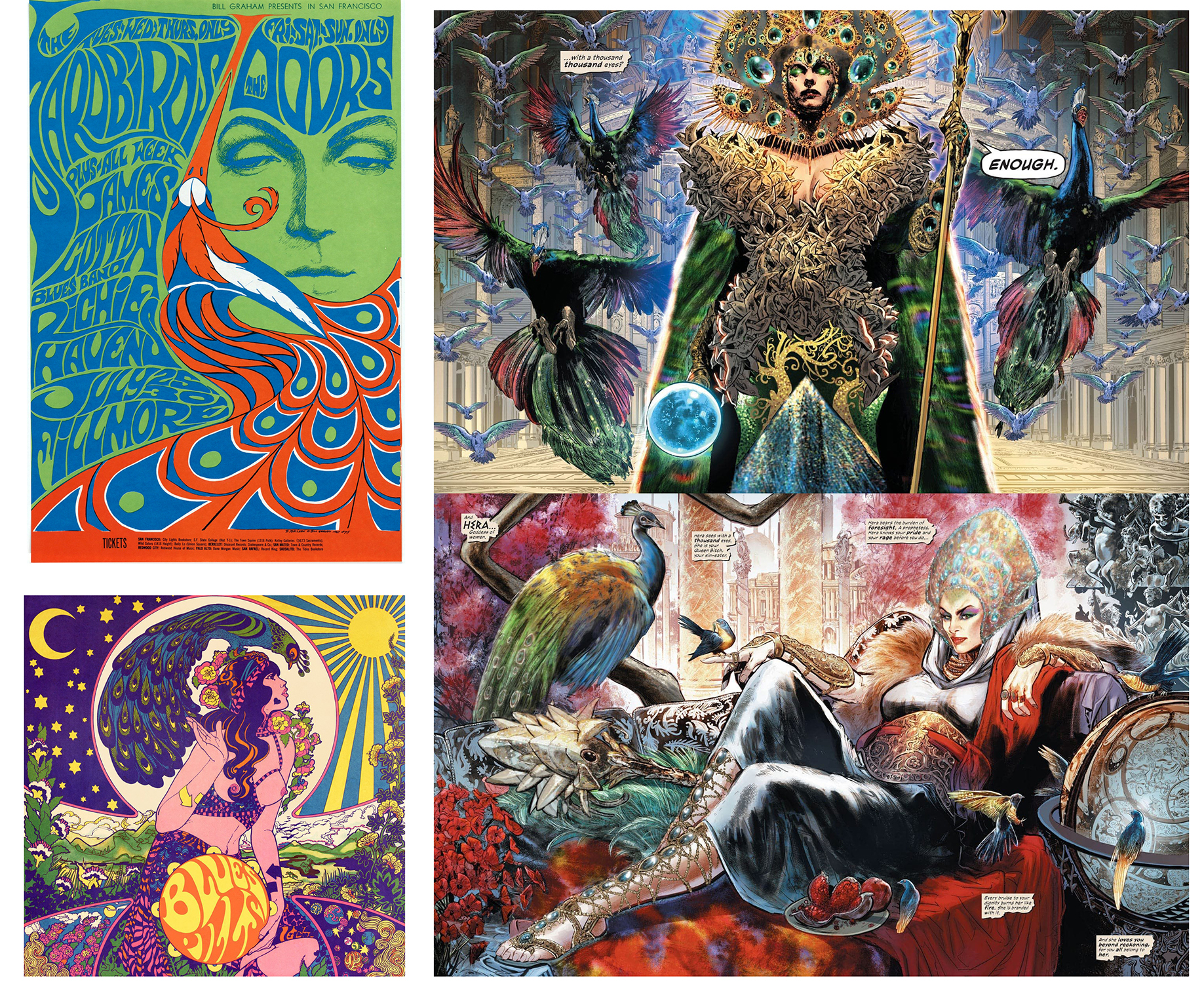
Perhaps the most dominant visual aesthetic is that of 1960s counterculture psychedelic art. Elements of psychedelic art includes surrealistic subject matters, intense depth and stylization of detail, contrasting colors and elements of collage. Psychedelic art was primarily informed by Art Nouveau, but in Historia, Jimenez also draws inspiration from High Renaissance Art, which is informed by the art of antiquity. Jimenez draws individuals in a manner that recall the works of Michelangelo and DaVinci surrounded in a brilliant, surrealistic psychedelic universe. If you look at the images below you can see the influences: on the left we have a poster created in 1967 by Bonnie Maclean as well as the 2014 album cover for the band Blue Pills created by Marijke Koger-Dunham. On the left are two panels from Historia.
Check out the Smithsonian’s National Museum of Asian Art 2014 installation of “The Peacock Room.”
While a wide range of animals are portrayed (which I love especially that panther with Hellene), Jimenez depicts the peacock rather prominently in Historia. In ancient Greek and early Christian art, the peacock was considered a symbol for immortality. Notably, in Greek mythology, the tail of peacock feathers are considered the eyes of the goddess Hera. Jimenez definitely did some deep research here as sometimes comic book artists depict Wonder Woman’s homeland of Themyscira in a generic ancient Mediterranean motif more informed by Hollywood than art history. Below on the left is a terracotta volute-krater (currently on view at The Met) that depicts the Greeks battling the Amazons. The ancient Greeks shared myths to convey their history. Greek artists painted scenes from myths on walls, vases, jars, and cups. On the right we have a panel from Historia.
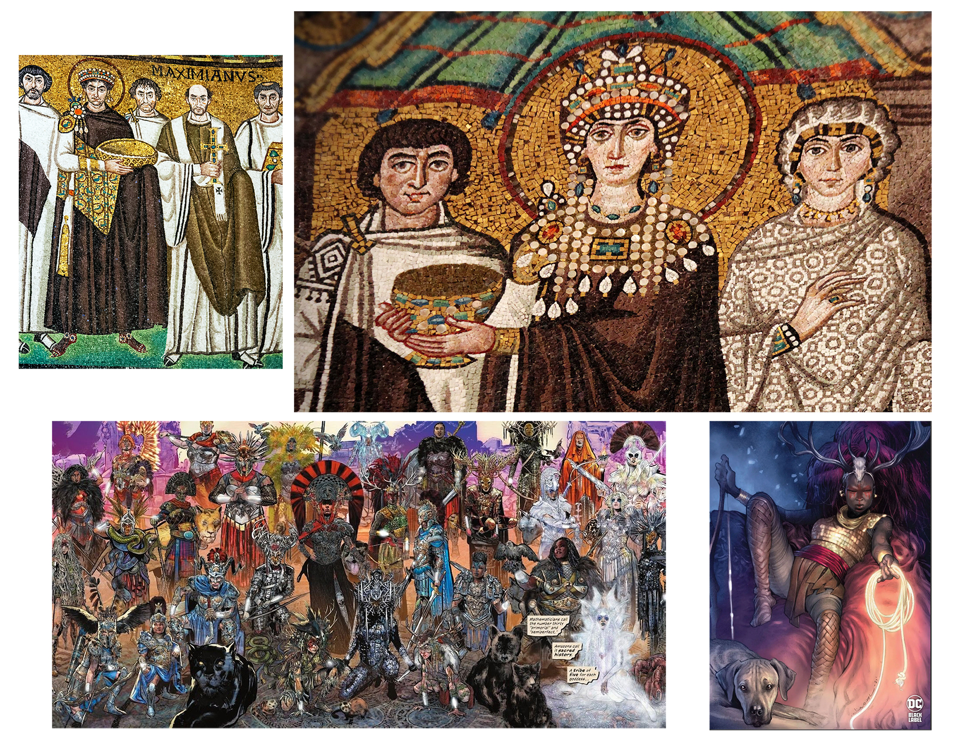
The Greek philosopher Aristotle, in Sense and Sensibilia, notes sight as the most important of the senses because of color. The significance of color as the ultimate manifestation of sight was fostered in Byzantium, where color was associated with both earthly and heavenly powerfulness. Color in the aesthetics of late antiquity and Byzantium is closely connected to that of light: light and color combine to emphasize brilliance, glitter, and polychromatism. Hi-Fi, Prianto, and Fajardo embrace and execute this brilliance in superb glory. Below are two mosaics from Basilica of San Vitale of Emperor Justinian and Empress Theodora along with two panels from Historia.
Wonder Woman Historia: The Amazons is a seminal work for comic books and a must own. In the spirit of the ancient world depicted in Historia, I would like to conclude this blog entry with some quotes from Aristotle on art.
“Art takes nature as its model.”
“The aim of art is to represent not the outward appearance of things, but their inward significance.”
“Art is a higher type of knowledge than experience.”
The memory of humankind can be found in museums. Humanity has a long history of preserving artifacts. Ancient Greeks filled temples dedicated to the muses with scholarship and sculpture. The ancient Greeks coined the term “mouseion” when they first built a temple to the goddesses who kept watch over the arts and sciences known as muses[1]. This tradition would be followed by conquering kings who exhibited spoils of war [2]. Later we had cabinets of curiosity that would become rooms filled with artistic treasures that were the domains of the wealthy elite, open only to the collector and the occasional visitor [3]. The Enlightenment, which concurrently fostered empirical thinking and imperialism, gave rise to the first museums in Europe. Museums in the United States were founded by wealthy patrons who emulated European models and collecting habits.[4]
From the Bottom Up
Five months before the Metropolitan Museum opened its exhibition, Harlem on my Mind, in January of 1969, Thomas P. F. Hoving, Director of the Metropolitan Museum of Art New York City, noted:
“To me Harlem on My Mind is a discussion. It is a confrontation. It is education. It is a dialogue. And today we better have these things. Today there is a growing gap between people, and particularly between black people and white people. And this despite the efforts to do otherwise. There is little communication. Harlem on My Mind will change that.”[5]
There was no meaningful dialogue. Instead, Harlem residents were excluded from the planning process and artwork by Harlem artist was curiously excluded. The museum instead decided to use oversized photomurals to display images of African American people. The exhibition set off protests that fostered activism from the African American art community that looked to address the patently patronizing discrimination.
Two years before Harlem on my Mind opened, in a stark contrast to The Met, The Smithsonian founded the Anacostia Community Museum in 1967 which focused on local African American history and culture unique to the Anacostia neighborhood. The Smithsonian Institution was founded in 1846 and is the largest museum complex and research center in the world[6]. The Anacostia Community Museum is one of the 19 museums, in addition to a zoological park, nine research centers, and 20 libraries that encompass the Smithsonian. The Anacostia Community Museum is the only Smithsonian museum that has a very local focus. The founding director of the Anacostia Community Museum, John Kinard, was a local minister, civil rights educator, and community activist whose engagement shaped the trajectory of the Museum [7]. The community’s values were embedded in the core ideals of the Anacostia Community Museum. With a focus on local African American experiences and community issues, the Museum evolved its exhibition programs to reflect broad national themes in African American culture in the 1980s. The Anacostia Community Museum is the only Smithsonian museum that has a very local focus. It was the first federally funded community museum in the United States but is under the umbrella of the Smithsonian Institution. The late 1960’s and early 1970’s would see a change stemming from the activism of the day and give rise to museums for the people by people.
The same year the Harlem on My Mind exhibition opened, two museums took root that stemmed from this era of vibrant activism. El Museo del Barrio was founded in Spanish Harlem and was first located in a public school storage room. It focused on the Puerto Rican art from the diaspora that settled in the neighborhood (“El Barrio” is Spanish for the neighborhood). One of the first shows, “The Art of Needlework” was dedicated to the crocheting techniques of Puerto Rican women[8]. Meanwhile, downtown, The Leslie-Lohman Museum, the only art museum in the world to exhibit artwork that conveys the LGBTQ experience, started to take root when Charles Leslie and Fritz Lohman, who had been collecting art for several years, mounted their first exhibit of gay art in their SoHo loft on Prince Street in New York City [9].
El Museo del Barrio’s founder, Raphael Montañez Ortiz, was part of a coalition of artists pursuing representation in New York museums. Unlike most museums in New York City at the time, El Museo was founded without assistance from wealthy patrons. It filed as nonprofit organization in 1971 [10]. Similarly, after that first loft show in 1969, Leslie and Lohman opened a commercial art gallery devoted to gay art, but it closed in the early 1980s with the arrival of the AIDS epidemic [11]. The pair then rescued the work of artists dying from AIDS from their families who wanted to destroy it. In 1987, the Leslie and Lohman applied for nonprofit status to establish a foundation to preserve their collection of gay artworks and continue exhibitions. The IRS actually objected to the word “gay” in the foundation’s title and hindered the nonprofit application until 1990 [12].
El Museo moved to its current location in 1977, on the ground floor of the city-owned Heckscher Building, on 5th Avenue and East 104th Street. Meanwhile, the Leslie-Lohman Gay Art Foundation’s first location was in a basement at 127B Prince Street in New York City. In 2006, the Foundation moved into a ground floor gallery at 26 Wooster Street in SoHo. In New York City, two museums took root around the same time that were truly by the people for the people: El Museo del Barrio and The Leslie-Lohman Museum. But are they still for the people? Have they stayed true to their original mission?
The Mirror Manifesto
The annual Museum Mile Festival, which went virtual in 2020, offers free admission to a 30-block stretch of Fifth Avenue for the following institutions: The Africa Center, El Museo del Barrio, the Solomon R. Guggenheim Museum, the Metropolitan Museum of Art, the Cooper Hewitt Smithsonian Design Museum, the Jewish Museum, Neue Galerie and the Museum of the City of New York. In addition to all the art inside, there are outdoor festivities including live music. In August 2019, The New Yorker wrote an article titled “The Battle Over the Soul of El Museo del Barrio [13]” noting that during the annual Museum Mile festival (of which El Museo was one of the founding members) a group of protesters distributed flyers that read “El Museo Fue del Barrio” (The Museum was from the neighborhood). The protesters read from a printed statement, called the Mirror Manifesto [14], that accused El Museo of abandoning its core values as a museum for the community of East Harlem. The Mirror Manifesto notes:
“It requires us to first contend with “El Barrio’s” identity. While Puerto Ricans were instrumental in the foundation of the museum, it is not strictly a Puerto Rican museum. It is a museo “del Barrio.” Further, demographic changes in East Harlem and the overall growth of the Latinx diaspora in the last 50 years render the nationalist led push to make El Barrio mean “Puerto Rican” null. If El Museo is to be resuscitated, we must lay these claims to rest and set about addressing who we mean when we say El Barrio.
If El Barrio means neighborhood, or enclave, and we are defining the institution as encompassing a diasporic latinidad, then what we are contending with is what is now being called “Latinx.”
This is distinct from Latin America and should not be confused. For too long, this ambiguity has rendered Latinx artists invisible. Latinx artists continue to be marginalized, underrepresented, and erased. El Museo has shamelessly latched on to this ambiguity and forfeited its original mission. It has done very little as an institution to foster and cultivate Latinx Art.
The museum has failed to launch a studio residency program, it has failed to create an environment where intellectual work for us, by us, can be incubated. It has failed to cultivate diverse board members that represent the Latinx community. It has failed to expand board members beyond funding/development needs, or made sure to its boards’ institutional actions, partnerships, and programs correspond with its mission.
Given the continued failure of El Museo del Barrio to fully embrace its responsibility to the many diasporas that make up the Latinx communities in NYC and across North America, generations of Latinx artists pouring out of BFA, MFA, & PhD programs have come to see the El Museo as irrelevant.
Recent calls to steer the institution back towards its intended mission therefore have remained unanswered. In order to reinvigorate working and emerging Latinx artists to invest their energy in an institution that has gone out of its way to communicate that it cares nothing for their cultural production, the institution must take radical steps to more clearly define what it is. EL MUSEO DEL BARRIO MUST BE EL MUSEO DE LOS BARRIOS. It must fulfill its original mission or relinquish control to the community of Latinx scholars and artists to steer it back on course. It must DECOLONIZE.
Latinx artists, cultural workers, scholars and concerned residents reject the elitism, white washing, LGTBQIA exclusion and anti-blackness perpetrated in the museum against its own museum goers and community of artists.”
How did El Museo get here?
During its first two decades in existence, El Museo’s mission was clearly defined as an institution that researched and displayed the cultural heritage of the Puerto Rican diaspora that lived in Spanish Harlem. By the late 1980s, Spanish Harlem was longer a Puerto Rican enclave; immigrants from Mexico, Central America, and the Dominican Republic had moved into the neighborhood. El Museo, with some struggle, reflected this [15]. However, in 2002, El Museo appointed its first non Latinx director, Julián Zugazagoitia, a Mexican who was previously at the Guggenheim. That same year, an exhibit devoted to Mexico’s most famous artists, Frida Kahlo and Diego Rivera was mounted [16]. For many in El Barrio, elite Latin-American art was overshadowing the El Museo’s grassroots mission. These concerns were fully realized this year when The New York Times reported that El Museo announced that its annual gala would honor Princess Gloria von Thurn und Taxis, a wealthy German art collector known for her connections to the European far-right and Steve Bannon who once complained that Pope Francis is too liberal. After considerable backlash, she was uninvited [17]. Two weeks after that faux pas, El Museo was inundated with complaints over a planned exhibit devoted to Chilean filmmaker and artist, Alejandro Jodorowsky. In the early 1970s, Jodorowsky said that a rape scene he performed for one of his films was real and not staged (something he later recanted). The exhibit was cancelled[18].
Why hasn’t the Leslie-Lohman Museum encountered similar issues? Both institutions started with the same idea: a museum by the people for people (OR for the marginalized by the marginalized). While both institutions engage the public in comparable ways, the Leslie-Lohman Museum still has not experienced the full growing pains: El Museo was granted nonprofit status nearly twenty years before Leslie-Lohman and it was only in 2011 that the State Board of Regents finally granted a Certificate of Museum Status[19]. However, the Leslie-Lohman museum does publish a quarterly journal, The Archive, while El Museo does not. El Museo’s early research should have been published in a peer-reviewed journal.
Perhaps the one significant thing that distinguishes El Museo from Leslie-Lohman has to do with its very specific geographical connection. The Mexican, Central American, and Dominican immigrants who moved into the neighborhood thirty years ago, as well as most of the Puerto Ricans, are now being forced out via gentrification[20]. The New Yorker article noted that the board includes only one member who lives in the neighborhood. The article also noted that El Museo’s founder, Raphael Montañez Ortiz, now resides in Highland Park, New Jersey. Interestingly, the Brooklyn Museum has recently explored the impacts of gentrification[21]. In November of 2016, anti-gentrification artists and activists protested the Brooklyn Museum when it hosted the 6th Annual Brooklyn Real Estate Summit, which was incongruent with the overwhelming gentrification hitting the communities the museum claims to serve. In April of 2018, an open letter[22] called for the Brooklyn Museum to use the public anger surrounding a curatorial hiring decision (Kristen Windmuller-Luna, a White woman, as an African art consulting curator) as an opportunity to address deeply rooted injustices pertaining to the museum that included the colonial history of the museum’s non-western holdings, the lack of diversity among its curatorial staff and executive leadership, the fact that the museum’s buildings sit on stolen land, and the museum’s role as an agent of gentrification in Brooklyn, a long-standing grievance of community groups.
“We are thus calling for the Brooklyn Museum to participate in the creation of a Decolonization Commission of the kind that has recently been demanded of institutions — like the city’s own American Museum of Natural History — that are being publicly asked to account for their own role in the histories of colonialism and white supremacy. This would send a strong message to the people of Brooklyn, and to other art institutions around the country, about the museum’s will to redress ongoing legacies of oppression, especially when it comes to the status of African art and culture. It could be a first step in rebuilding trust with the communities to whom the museum should be accountable.
This decolonization process would have a time-frame, starting with the acknowledgment that the buildings sit on stolen indigenous land, that they contain thousands of objects expropriated from people of color around the world, and that the institution is governed by a group of majority-white members of the 1% actively involved in the dynamics of racialized dispossession and displacement in Brooklyn. Further steps would entail decisions about the framing of the display of its collection; who is appointed to make these decisions, and in consultation with which communities of conscience in the borough and beyond. Decolonization is never a finished process, but, once undertaken, its logic can and should unfold in ways that are transparent and just.”
El Museo needs to do the same starting inside its own doors. Interestingly, in response to the letter, Anne Pasternak, the director of the Brooklyn Museum, said that the museum “unequivocally” stood by its selection of Kristen Windmuller-Luna for the position.
Regardless of who lives in the neighborhood, El Museo’s leadership should not lose site of the museum’s mission. I would be the first to object if the Leslie-Lohman Museum decided to one day display the work of LGBTQ allies—regardless of their good intentions, they will never understand and properly convey the experience of being LGBTQ, the museum’s mission. The Mirror Manifesto protestors are right, the museum leadership has been gentrified and operating under a disguised blanketed term, “Latin American,” that solely considers the virtue of surname without considering the Latinx communities, and their art, fostered by diaspora (regardless of whether it is from Puerto Rico, Mexico, the Dominican Republic or Central America). And while I certainly think that everyone should experience the work of artists like Frida Kahlo and Diego Rivera, their work comes from a different PLACE (and time) that has little to do with Spanish Harlem, or the Latinx communities now living and creating in New York City and the United States.
The COVID Denouement
Like every other New York City Museum, El Museo shut down in mid-March of 2020. The annual gala, which normally brings in about $1 million dollars, was canceled, event rentals for the newly restored theater space were also cancelled and its store and cafe were closed. A Paycheck Protection Program loan of about $500,000 helped, as well as a $600,000 grant from the Mellon Foundation but they were still losing money. In September, El Museo’s Executive Director was approached by a representative from the Ford Foundation, which had just announced a $156 million initiative called America’s Cultural Treasures, whose contributors include 16 foundations and private donors. El Museo received 68% of its annual budget in one swoop from the Ford Foundation[23].
Meanwhile, at the Leslie-Lohman Museum, the director, Gonzalo Casals, announced, just before the lockdown in March of 2020, that he was leaving to become the Cultural Affairs Commissioner of New York City[24]. A new director, Alyssa Nitchun, was hired in December of 2020. Nitchun is the first queer woman to lead the museum. The New York Times reported that her first mission will be to expand the institution’s reputation abroad and help secure its financial future: “My dream is that we can scale up, welcoming a whole new group of artists and audiences.” [25]
Interestingly, the Leslie-Lohman Museum held an exhibition that would have been perfect for El Museo: “Laura Aguilar: Show and Tell,” is a retrospective that was part of “Pacific Standard Time: LA/LA,” a Getty Foundation-sponsored 2017 exhibition of more than 70 concurrent exhibitions in and around Los Angeles that together demonstrated the influence of Latin America and Latino art on the city [26]. In the 1980s, Aguilar came out as gay and in 1986, she began a portrait series titled, “Latina Lesbians.” Meanwhile, at El Museo, it looks like the words and actions of the Mirror Manifesto did not fall on deaf ears.
“Estamos Bien” is El Museo’s first national survey of what it calls Latinx art, using the oft-debated gender-neutral alternative to Latino or Latina, to describe artists of Latin American descents working primarily in the United States. The museum’s original plan was to have the show coincide with, and reflect, two defining 2020 political events: the United States census and the presidential election. The pandemic derailed that. The title, “Estamos Bien” (“We’re fine”) was inspired by a work in the exhibition, a 2017 painting by the Chicago-based artist Cándida Álvarez, completed in the wake of the devastation by Hurricane Maria on Puerto Rico.
The title, “Estamos Bien”, truly embodies El Museo’s history: equal parts of acrimony and hope. However, it is a step in the right direction that promises more and better representation.
[3] Starn, Randolph. “A Historian’s Brief Guide to New Museum Studies.” The American Historical Review, vol. 110, no. 1, 2005, pp. 68–98. JSTOR, http://www.jstor.org/stable/10.1086/531122. Accessed 1 May 2021.
[4]Alexander, Edward P. Museums in Motion. Chapter 1, “What is a Museum?”
[5] “Black Artists and Activism: Harlem on My Mind (1969)” Author(s): Bridget R. Cooks American Studies, Vol. 48, No. 1 (Spring 2007), pp. 5-39
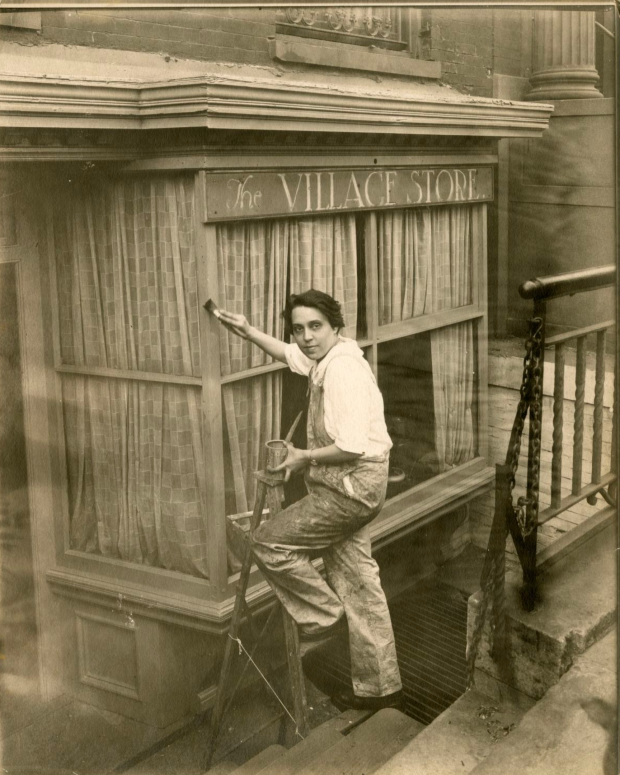
Charlotte Powell, Village Painter seems to be following me around. Most recently, it came up in a course I recently completed for my graduate degree in Museum Studies. I also belong to many historical New York City photography groups on Facebook (Al Ponte’s Time Machine – New York and Bronx Third Ave El are two of my favorites) where I have seen it several times as well as websites like Gothamist and Monovision.
About the Photographer
Jessie Tarbox Beals (1870-1942) was a pioneer for women, working as the first published female photojournalist in the United States. While working, she carried heavy camera equipment while donning the bulky women’s fashions of the late 19th and early 20th century. Beals later opened her own studio as a divorced, single mother.
At the turn-of-the-century Beals lived and worked in Greenwich Village, which she photographed extensively. Greenwich Village, which resisted the City planning idea of the grid, was a haven for bohemian artists and writers. Beals may have found like-minded peers. It seemed natural that she would gravitate toward photographing the bohemians of Greenwich Village in New York City—the part of the City that said no to the grid and gave birth the Gay Liberation movement! In her photograph of Charlotte Powell, Beals captured a fellow unconventional woman, dressed in overalls, doing traditional men’s work
Notes on the Photograph
The first thing I would like to note about this photograph is the fact that an early 20th century woman is wearing pants. And she is not wearing pants to be fashionable like Marlene Dietrich, she is wearing overalls, work pants, not unlike Amelia Earhart’s aviator pants. Like Earhart, Charlotte Powell is seen working at what was then considered men’s labor. In contrast to her overall gruff fashion, Powell is wearing a rather delicate looking watch. I couldn’t help but wonder what Beals was wearing when she took this photograph.
We see two sets of stairs in this photograph. Stairs are a principal and practical part of architecture that stand with a sense of purpose. In the same way that water gives and takes life, stairs can bring us up and plunge us down. Powell may be at the bottom of the stone stairs, but she is slowly climbing out of the prison (see the bars on the far right) of cultural norms on a rickety ladder being held together by string, of her making.
I find the sign above Powell concurrently appropriate and irksome. Appropriate because it gives us a geographic marker of sorts and irksome, because the curtains are drawn, and we have no idea what that The Village Store sells. But the sign is also well designed—I admired the way the typeface emphasized The Village.
While writing this, I became more intrigued by the photograph and tried to find this location using Google Maps. I wanted to see if this building was still standing. New York undervalues older buildings. I was unsuccessful in finding the possible location of this photograph.
This digital image may be used for educational or scholarly purposes without restriction. Commercial and other uses of the item are prohibited without prior written permission from the New-York Historical Society. For more information, please visit the New-York Historical Society’s Rights and Reproductions Department web page at http://www.nyhistory.org/about/rights-reproductions
I visited the Brooklyn Museum on the opening day of the wonderful and timely exhibition, “Frida Kahlo: Appearances Can Be Deceiving.” I naively thought that I could beat the crowds: after all, I had arrived at admissions at 12 noon, exactly one hour after the museum opened. Instead, I was surprisingly told I would have to wait until 2:30pm to enter the exhibition (in the meantime, I was able to enter and explore the rest of the museum)! My first recommendation is to buy tickets in advance. I checked the website and noticed that weekend shows for the next several weeks are already sold out.
My second
recommendation is to put away your phone! Visitors are told that photography is
not allowed, but that didn’t stop quite a few rude people from taking out their
phones and ruining the experience for others. If you are one of those people
who just can’t help themselves, consider this for a moment: when you snap a
picture of a painting, that you can probably find online via a museum website,
how often do you go back and look it? How often do you study it? Why ruin a
rare moment of seeing a painting in person by fumbling with your phone? And if
you are snapping a picture on your phone for posting on social media, the
exhibition has two interesting displays to do just that before you enter the
actual exhibition.
The exhibition
is presented thematically, using paintings by Kahlo and peers, photographs, and
Mexican ceramics to explore Kahlo’s identity. Clothing and make-up are central
to this: for example, Kahlo used native clothing to express her Mexican
nationalism. It was surprising to see that she loved
using perfume and Revlon products (Revlon is the major supporter of this show).
Many of these items had been stored in Casa Azul, the home, Kahlo shared with
her husband, muralist Diego Rivera.
One of the most absorbing, and heartbreaking,
pieces of art was a lithograph depicting Kahlo’s miscarriage. It was as
powerful as the “Henry
Ford Hospital” painting, which explores the same subject. I absolutely
adored the home movies that were shown, which I saw twice! Among my favorite
pieces were the photographs, many of which I had never seen before. Standouts were
those by Gisele Freund, known for
her documentary photography and portraits of writers and artists.
The major problem with this exhibition
is how some of the artwork is displayed, most notably the photographs. Many are
presented in groups of four, with two of the four well below eye range. This means
that if two people stand in front of the four pictures, others have to wait to
properly study and contemplate them (as well as contend with the impolite
people who insist on taking pictures). With the crowds, this simply does not
work. The first two rooms were rather small with one wasted on a second ticket
checkpoint. Yes, there were two
checkpoints to get into the exhibition: one at the door and one in front of a wall,
projecting images of Kahlo. A wall. Interesting.
It has been over sixty years since Kahlo has passed away, but she still continues to fascinate. This exhibition is worth seeing—but only if you can go during a weekday, with minimal crowds. Each piece is worth quiet contemplation. The exhibition notes how much she loved New York City—the world is here and that is what she embraced and probably why we embrace here today. She is a voice from Mexico’s past conveying the need for more bridges and less walls.
Camille Paglia, in her book, Sexual Personae, presents an interesting theory on the relationship between cats and ancient Egyptians. Cats, which have a sense of narcissistic personality and ceremony, were the model for Egyptian culture. According to Paglia, Egyptians invented concepts of beauty and femininity from their observations of cats 1. I found this theory thought provoking and would, for years after first reading Sexual Personae, look for other examples of how animals can impact a culture. A favorite example are the Aztecs, who according to legend, founded the city of Tenochtitlan when their god Huitzilopochtli had commanded them to find an eagle perched atop a cactus, devouring a snake.
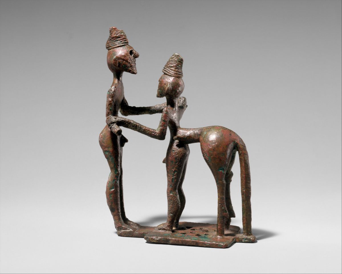
Bronze man and centaur, mid-8th century B.C.E.
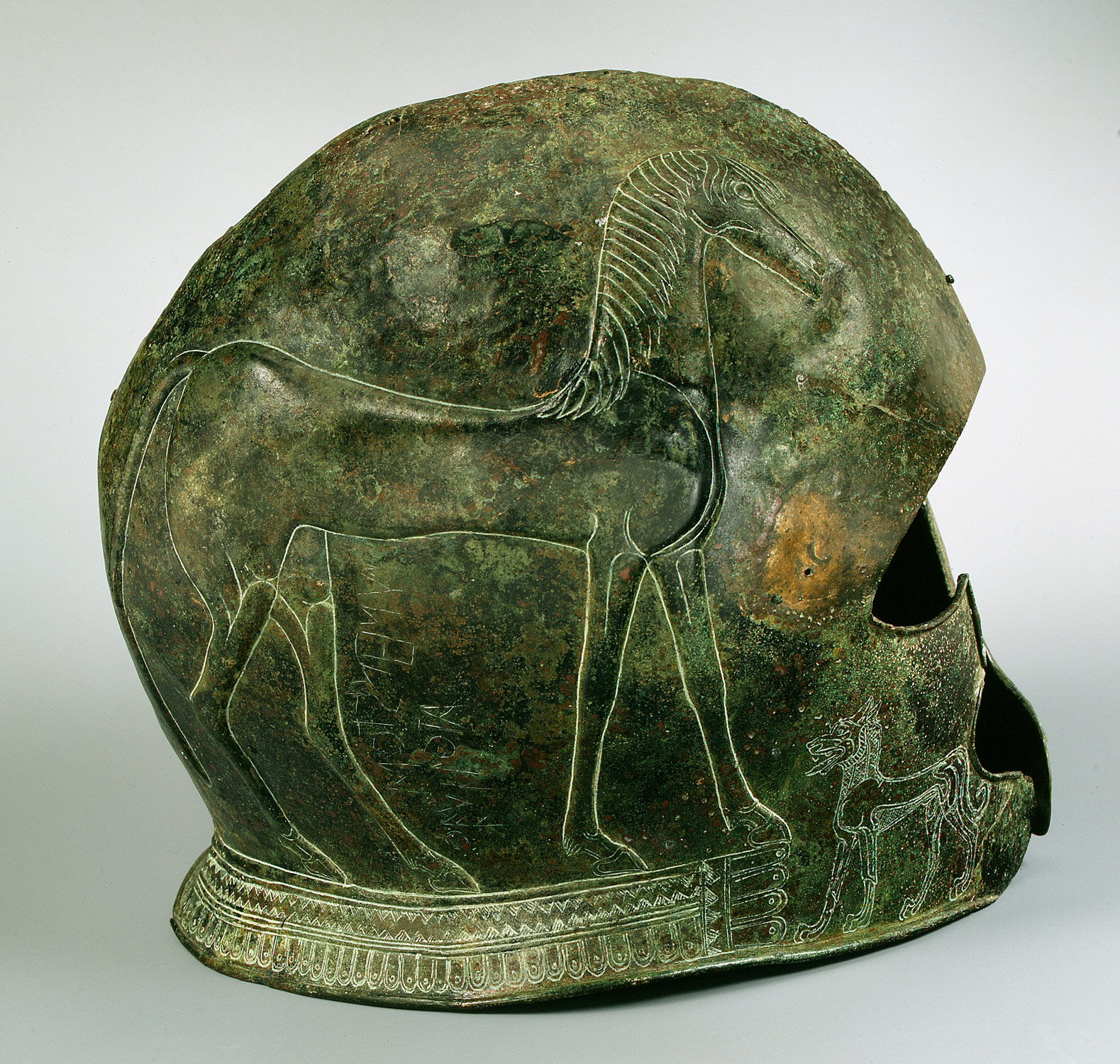
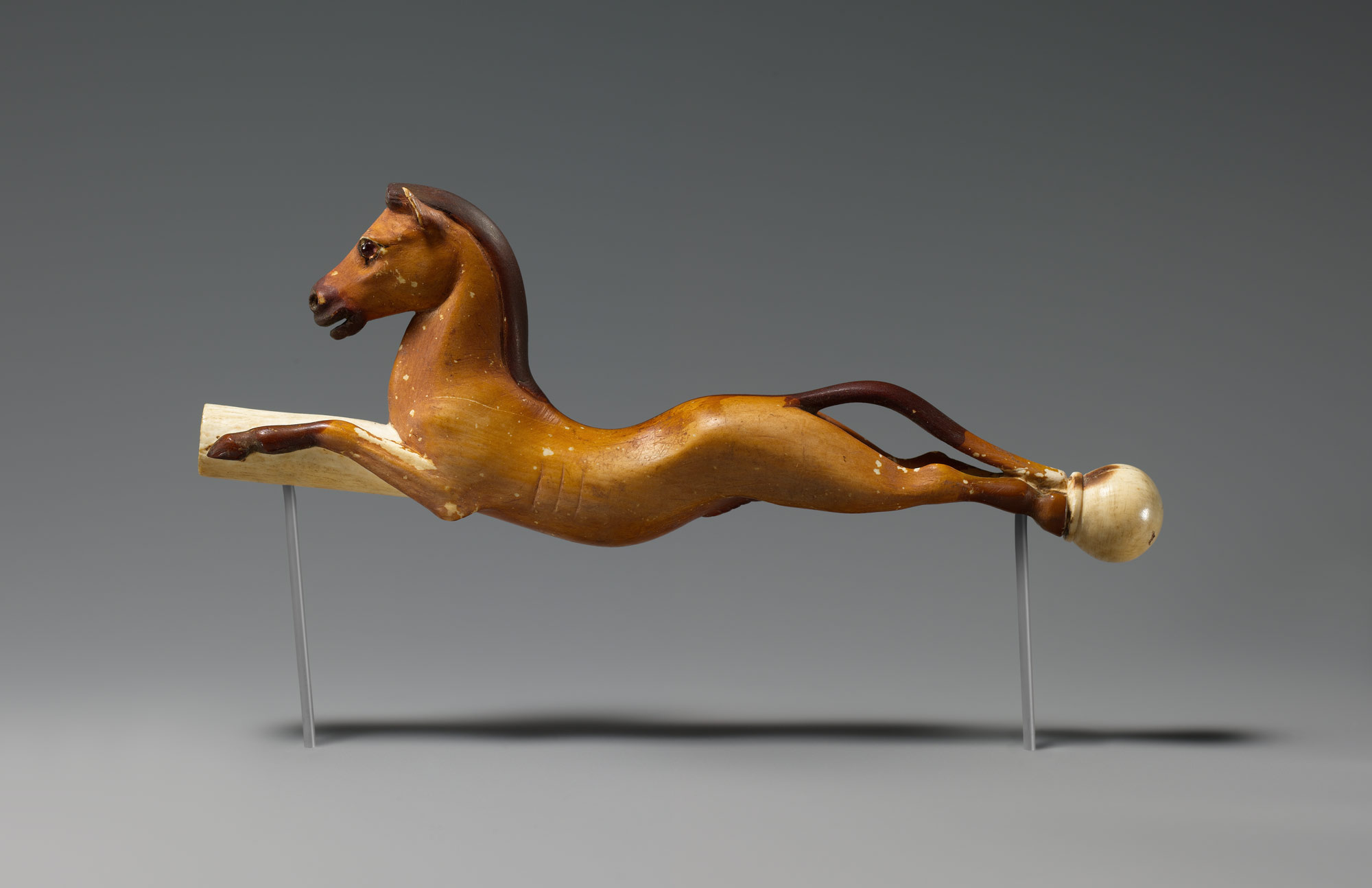
Paglia makes an interesting contrast between Egypt and Greece: In Egypt, the cat; in Greece, the horse. Another way to view it is, in Egypt, the Sphinx; in Greece, the Centaur. Paglia hypothesizes that cats were “too feminine for the male loving Greeks” who preferred to depict the more muscular horse in art 2. Paglia’s theory appears to be realized on an Archaic helmet from the late 7th century B.C.E. where a horse and two lions (one on each cheek piece) are portrayed in repoussé; the horse is about three times larger than the lions. Conversely, Egyptian depictions of horses appear to be more feminine than Greek muscular / masculine forms (figure III).
One of Two bronze helmets, late 7th century B.C.E.
Egyptian Horse, 1391–1353 B.C.E.
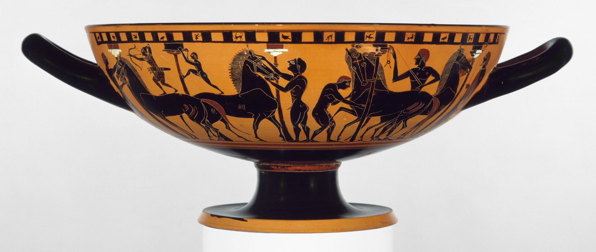
The ancient Greeks rarely depicted contemporary or historical events in art. However, horses were consistently present in mythical and historical depictions alike. This blog entry will examine the presence of the horse in narratives depicted on various Greek works.
Death and War
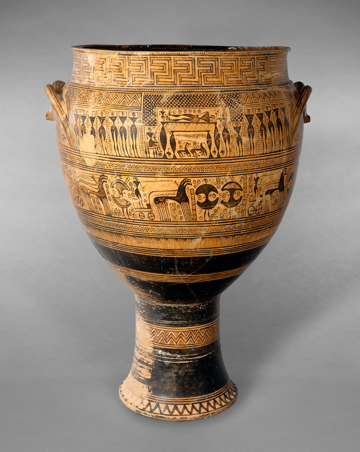
Ancient Egyptians venerated cats and mummified them. The practice of interring horses was not uncommon in Greece 3 (a pair of horses were discovered buried at the outer end of a Stholos tomb at Marathon (The Mycenaean tholos tomb consists of a circular, subterranean burial chamber, sometimes referred to as the thalamos, roofed by a corbelled vault and approached by an entrance passage that narrows abruptly at the doorway actually opening into the tomb chamber. The chamber or thalamos is built of stone. Tholoi of this kind are usually set into slopes or hillsides. Burials were either laid out on the floor of the tomb chamber or were placed in pits, cists, or shafts cut into this floor.); a human skeleton was discovered with a horse skeleton in a grave near Nauplia). Like the cat in Egypt, Horses were also featured prominently in works connected to funerary traditions. A Geometric krater, (740 B.C.E.) from the Dipylon Cemetery,
Terracotta krater, 750–735 B.C.E.
that functioned as a grave marker, depicts scenes of mourning for a man; the horses are pulling a chariot in his honor 4. One theory suggests that the horse with chariot was a transporter to the afterlife 5. The practice of depicting horses on grave markers continued to be common into the late classical period. Several loutrophoros vessels, which were used as grave markers for soldiers, depict young men on horseback 6. Ancient Greek citizens were required to perform a number of duties to help serve their community in the best way possible; soldiers saw the act of war as an act of patriotism. The depictions may be viewed as a commemoration of the solider and horse. The horse is as proud as a soldier, but unlike donkeys, cows, or bulls, is decidedly trainable and will, with no hesitation, ride into battle. Horses are in line with the concept of unselfish Greek citizenship (unlike cats, which are self-serving animals).
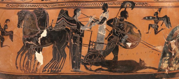
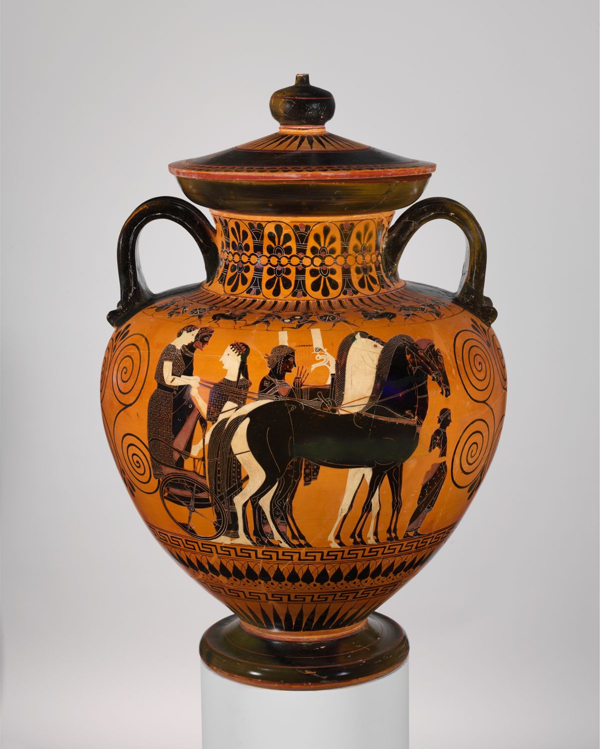
Depictions of horses were not solely limited to krater or loutrophoro vessels. A black figure terracotta amphora (Figure V) depicts a departing warrior on a four-horse chariot bidding his parents farewell. Interestingly, one of the four horses are not depicted in black figure, actually matching the color of the charioteer, also not in black figure. It is also curious that the charioteer was in the foreground while the solider and his family was in the background and behind the chariot. Could this have also been a commemoration of charioteer and horse for their contributions to the cause?
Terracotta neck-amphora, 540 B.C.E
Mythology and Reality
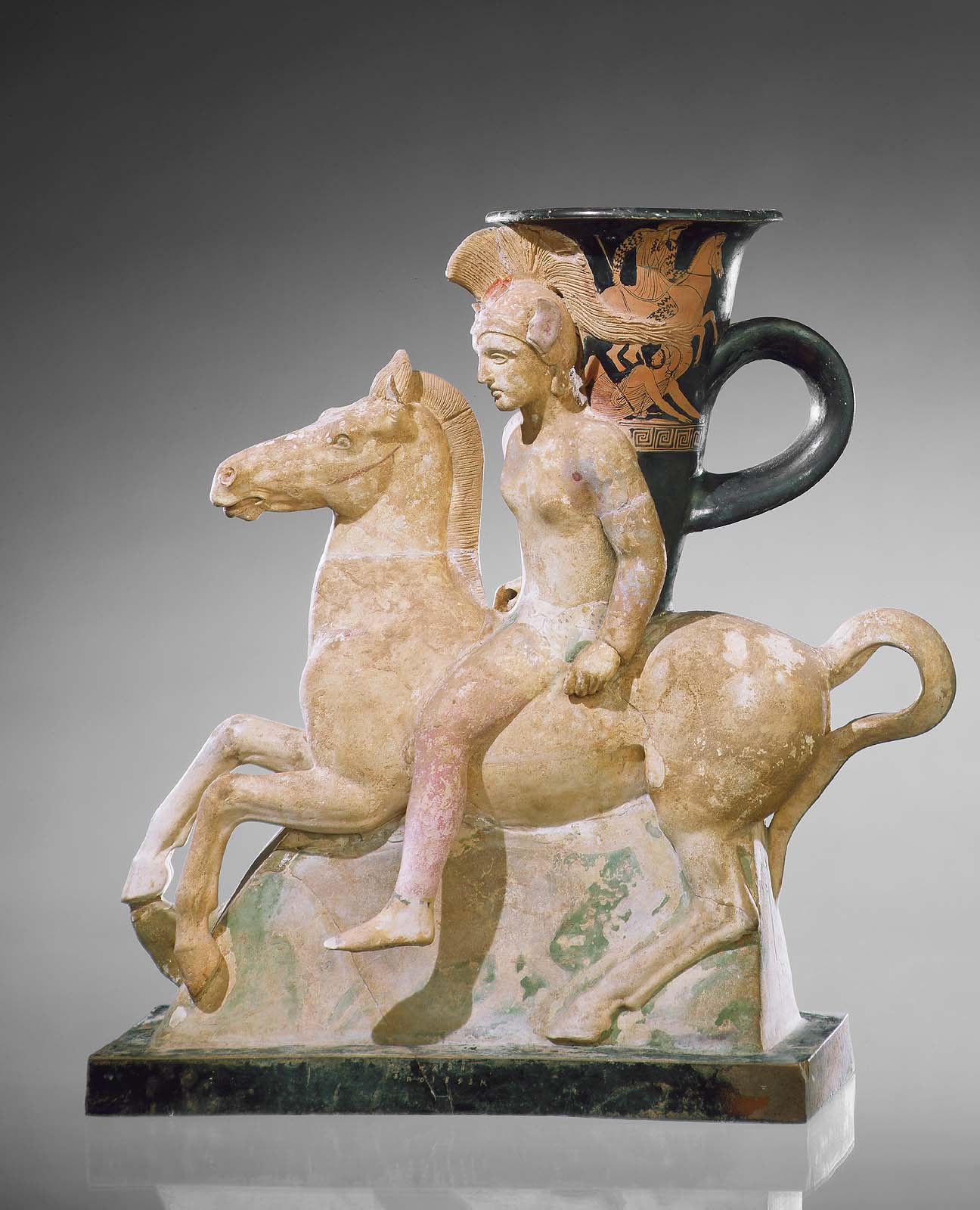
Rhyton in form of mounted Amazon, 5th century B.C.E .
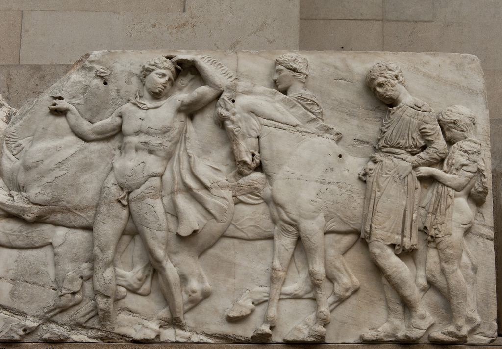
The horse, featured prominently in pottery narratives depicting combat and death, is also a fixture in mythology. One of the most remarkable works of a mythological subject prominently featuring a horse may be found at the Boston Museum of Fine Arts, which I had the opportunity to visit earlier this year. The museum identifies the work as a rhyton in the form of a mounted Amazon. Another source identifies this same work as a plastic vase 7. The mounted figure wears a crested plume helmet with large appendages on the sides. The red figure vessel behind the Amazonian warrior depicts four figures, Persians and Greek, in combat. A Persian figure is mounted on a horse and appears to be overtaking a Greek warrior with a spear. Conveniently, the Amazon’s plume is bellowing on to the scene. However, it is interesting to note the striking difference between the Persian and Greek horses; the Greek horse that the Amazon is riding is muscular, while the Persian horse appears to be almost Rubenesque and not proportionate. The Greek horse also has a gait / gallop similar to the horses depicted on the Parthenon frieze, which is a somewhat curious because the Amazonian rhyton was found in Egypt.
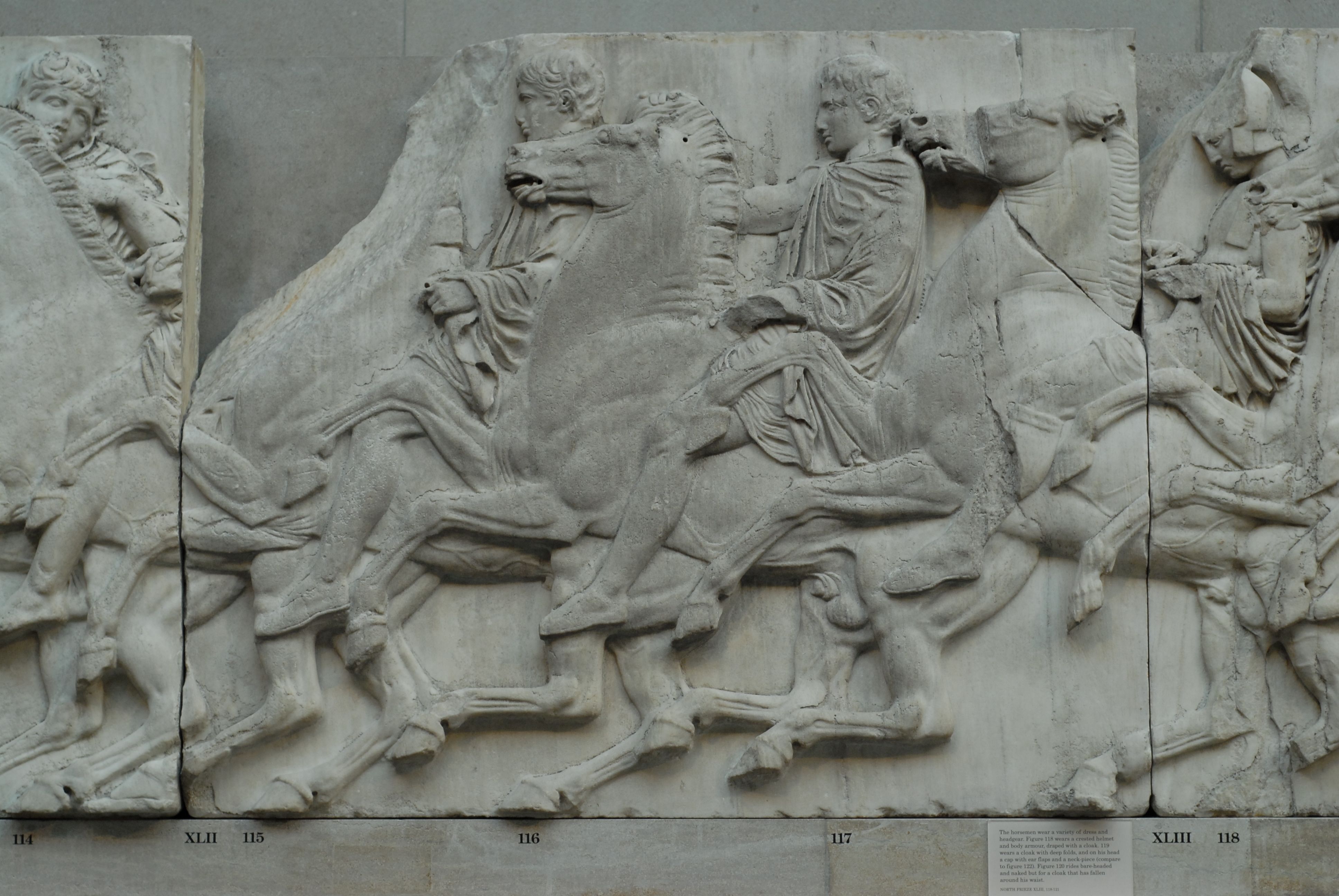
Details of the Panathenaic Festival procession frieze, 447-438 B.C.E.
Kylix, 540–530 B.C.E.
The frieze on the Parthenon is thought to represent the Panathenaic procession, a religious festival held on 28 Hekatombaion, the first month of the Athenian calendar 8 . The presence of the horse on the frieze of the Parthenon clearly demonstrates their importance in Greek society, real and mythological. According to mythology, Poseidon desired Demeter and to put him off, Demeter asked Poseidon to make the most beautiful animal the world had ever seen. Poseidon created the horse. The horses represented on the frieze are based on the Greek ideal perfect proportions. Beauty and proportion are bedfellows in ancient Greece.
North frieze, 447-438 B. C. E.
One part of west frieze of the Parthenon depicts horsemen preparing their horses. The care that the horsemen appear to be giving their horses recalls one of the first manuals on riding the horse titled The Art of Horsemanship written by a Greek named Xenophon. Xenophon, who was a pupil of Socrates, was an equestrian for his entire life, first as a cavalryman and then as a country gentleman on an estate given to him by the King of Sparta 9. Xenophon, in the same manual, encourages a mutual respect between man and horse: “There are, indeed, other methods of teaching these arts. Some do so by touching the horse with a switch under the gaskins. For ourselves, however, far the best method of instruction, as we keep repeating, is to let the horse feel that whatever he does in obedience to the rider’s wishes will be followed by some rest and relaxation.”
Xenophon’s approach to horse care and training appears to be realized on a kylix in the Met attributed to Amasis painter. The reverse depicts an atmosphere of excitement in Poseidon’s stables, while four grooms attempt to soothe four high-strung horses. The obverse depicts Poseidon among Greek warriors. The subjects are drawn from book 13 of Homer’s Iliad: Poseidon, seeing the Greek soldiers hard pressed, decides to renew their spirit. Prior to viewing this work, I happened to view a Terracotta pykster (figure IX) that depicted soldiers mounted on dolphins. I found it curious that the scene on the pykster depicting the dolphins was not a work connected to the god of the sea, Poseidon. Instead, the pyskster chose to depict Poseidon’s most beautiful creature, the horse.
Conclusion
Horses were an integral part of ancient Greek culture. Horses resemble the Greek ideal human form in terms of proportion and musculature. “Coming to the thighs below the shoulder blades, or arms, these if thick and muscular present a stronger and handsomer appearance, just as in the case of the human being” 10.
Horses are also in line with Greek concepts of citizenship. “Such an animal, we venture to predict, will give the greatest security to his rider in the circumstances of war.”10
“The majesty of men themselves is best discovered in the graceful handling of such animals. The man who knows how to manage such a creature gracefully himself at once appears magnificent. A horse so prancing is indeed a thing of beauty, a wonder and a marvel; riveting the gaze of all who see him, young alike and graybeards. They will never turn their back, I venture to predict, or weary of their gazing so long as he continues to display his splendid action. Such are the horses on which gods and heroes ride, as represented by the artist.”
– Xenophon, The Art of Horsemanship
1 Camille Paglia, Sexual Personae (New York: Vintage Books, 1990), Page 64
2 Paglia, Page 65
3 Jack Leonard Benson, Horse, Bird & Man; The Origins of Greek Paintings (Amherst, University of Massachusetts Press, 1970), Page 20
4 Fred S. Kleiner and Christin J. Mamiya, Gardner’s Art through the Ages, The Western Perspective (Belmont, CA: Thomson Learning, 2005), Page 94
5 Benson, Page 24
6 Andrew Clark, Understanding Greek vases: a guide to terms, styles, and techniques (Los Angeles: J. Paul Getty Museum, 2002), Page 115
Artist Lucien Smith misses an opportunity and simply creates novelty art for the 1%.
How did the Bronx become the poster child for urban decay in the 1970’s and 1980’s?
Generally speaking, individuals like Robert Moses siphoned monetary resources out of New York City to build up the surrounding suburbs while concurrently fostering the automobile and neglecting mass transit. The Cross-Bronx Expressway has NEVER benefited the Bronx and actually contributed greatly to the destruction: people once lived where this roadway now stands. And then the 3rd Avenue El, which had played a significant role in the creation of entire neighborhoods, was razed, leaving many isolated from public transportation and further devaluing real estate. Industry fled for various reasons that included moving to southern states that outlawed unions via “right to work” laws. The middle class tax base moved away and the poor and people of color moved into their former neighborhoods, which were subsequently redlined by banks and investors (Harlem, for example, had been red lined since the 1920’s). The media portrayed people of color as gun totting, drug-using savages who burn and vandalize their neighborhoods. They are bad for real estate, a stigma that has had an almost mythic impact. The fact is that the landlords of these redlined areas paid arsons so that they could collect insurance. I am fairly certain that artist Lucien Smith or his recent benefactors, Somerset Partners, are cognizant of these facts or bothered with any research.
On October 29th, in a former South Bronx piano factory, a rave took place that was hosted by real estate developers Somerset Partners. The rave was to launch the re-branding of the South Bronx as the “Piano District” in the tradition of DUMBO, Hudson Heights, iTri and East Willamsburg. The event, which was curated (or decorated, depending on your source) by Mr. Smith, included flaming garbage cans and bullet-riddled cars. From the photographs I have seen, it was essentially disaster porn.
Much has been written about the rave and perhaps the best source is Ed García Conde’s oft quoted blog Welcome2TheBronx. As a fellow artist who works in the Bronx, I found myself wondering why Mr. Smith would produce something so utterly jejune.
“I reached a point when I was independent financially and I was able to take a step back. I was producing work like a madman—I wanted to be this “superartist,” and I saw artists going down that road, and I didn’t want that anymore. I wanted to find a more honest approach to making art.”
When asked about future shows he responded:
“As far as future shows, I don’t have anything on my plate. I’m being very careful about what I do now.”
This interview was published in July of 2015. If Mr. Smith was being truthful, he was not working on the rave yet — an indication that it was simply thrown together. In response to the criticism, Mr. Smith noted:
“…people are always going to have their own interpretation. Let’s just remember New York, in its entirety, is a city that has and still struggles with violence and poverty, not just the Bronx.”
Mr. Smith, of all people, should understand the mythic power that images can have and missed an opportunity to use his fame to elevate those who struggle with violence and poverty. It was also an opportunity to convey how struggle creates great art. The late, distinguished CCNY Professor of Political Science, Marshall Berman, once said:
“Grace Paley, one of the great New York writers, has a story written early-’70s South Bronx. And one of the characters, who’s like a community organizer there, says, “The buildings are burning down on one side of the street, and the kids are trying to put something together on the other.” And this could be a parable of one of the great achievements of that period from a lot of the neighborhoods that were most devastated in New York. The earliest form in which most people who weren’t part of that neighborhood saw it were the graffiti that appeared on the subways in the ’70s. And this was on a very rickety, decaying generation of gray trains, they painted enormously exuberant, colored names and reliefs and mottoes. And you can see many films now: a gray day, a gray neighborhood, an El train. And suddenly, the El train, it’s like a rainbow! And it’s thrilling. The next incarnation was rap. The earliest form that people saw would be there would be one kid rapping with small speakers and a drum track in the subway, you know, with a hat open for money. And, you know, these are parables of a city that’s being ruined, that’s being destroyed, and that’s saying, “We can rise again. We come from ruins, but we’re not ruined.” And, I mean, in 15 years, it’s become the basic form of world music. So it’s a thrill, but it’s important to understand that it came from totally burnt-out, ruined districts, and that’s where it was born. And that it was born out of this suffering and misery, and that a lot of the creativity that New York has always had has come from the cellars, from the ruins, from how the other half lives.”
Picasso’s Guernica was painted as a reaction to the Nazi bombing on the unarmed Basque town during Spanish Civil War. It has since become a symbol for peace. Columbia University Art History professor, Simon Schama, once said that Picasso with Guernica “…rescued modern art from the curse of it’s own cleverness, from the curse of novelty. Guernica has always been bigger than art, uncontainable by mere museum walls. It is one of those rare creations that gets into the blood stream of common culture.” In other words, it does what great art should: communicate to everyone regardless of education or economic status.
In August of 2014, Mr. Smith gave a TEDx talk at Columbia College where he discussed how discovering his father cheating on his mother created a fear of failing that has fostered his career. His father responded to this by calling his son a “gold digging bitch” and noting “My ex-wife, who shares his lust for superficiality and materialism, raised him.”
What Mr. Smith has done with this show in the South Bronx is to further foster gentrification by creating novelty art that is exclusively for the 1%: it is their view of the Bronx and is nothing short of pusillanimous.
—–
Please note that the featured image of this blog entry was not part of the South Bronx re-branding event. I discovered it on Mr. Smith’s website while doing some research and have been wondering why, as a man of color, he felt compelled to paint this.
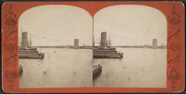
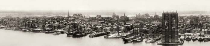
The first line in the prologue of Alan Trachtenberg’s vivacious study on the Brooklyn Bridge states, “Brooklyn Bridge belongs first to the eye.” Trachtenberg further goes on to describe the experience of walking over the bridge; how the stone towers “seem to frame the irregular lines of Manhattan” and how the steel “cable compels the eye.”
The Brooklyn Bridge also belongs to, and is a colleague of, the camera: modern structural engineering and photography both evolved simultaneously and explored new ways of looking at the organization of space and visual representation. Equally significant is the role that both played in America’s industrial growth.
“As photography bespoke the influence of new technology-new ways of seeing and experiencing-its practitioners rushed to the nation’s burgeoning cities. From Albert S. Southworth and Josiah J. Hawes’s early daguerreotypes of Boston, through George R. Fardon and Eadweard Muybridge’s San Francisco panorama’s and Robert Newell and John Moran’s cityscapes, to the urban images of Henry R. Koopman in Chicago and George Francois Magnier in New Orleans, photographers strove to capture and present the new modern environment. Nowhere was this mission more keenly felt than in New York City. As the city marched uptown, as buildings and neighborhoods were created and demolished at a staggering rate, the camera was there to document every stage and each new detail.” – Richard Haw
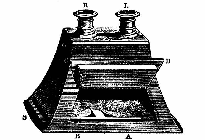
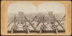
Stereoscopic views were perhaps the most effectual method of documentation because of their three-dimensional quality. Stereoscopic photography began in England when Sir Charles Wheatstone published “Contributions to the physiology of Vision-on Some Remarkable, and Hitherto Unobserved, Phenomena of Binocular Vision,” a paper he presented to the British Royal Society in 1838. Wheatstone demonstrated that the mind perceives an object in three dimensions because each eye receives a somewhat different view. To define this phenomenon, he devised the word stereograph, from the Greek words stereo (solid) and graph (I look at). Wheatstone prepared drawings of single objects seen by each eye and devised a viewing instrument of angled mirrors called the stereoscope. After the announcement of Daguerre’s and Talbot’s photographic processes in 1839, Wheatstone commissioned Talbot and Henry Collen to make stereo daguerreotypes and calotypes. Research by Sir David Brewster resulted in the a stereoscope that duplicated the normal 2 ½ inch separation between the eyes by placing a pair of lenses side by side in a small box with a lid at the top to admit light and a slot at the opposite end for inserting the mounted pair of stereoscopic images. A version made by French optician Louis-Jules Duboscq was presented to Queen Victoria after she admired the invention at the Great Exhibition in 1851.
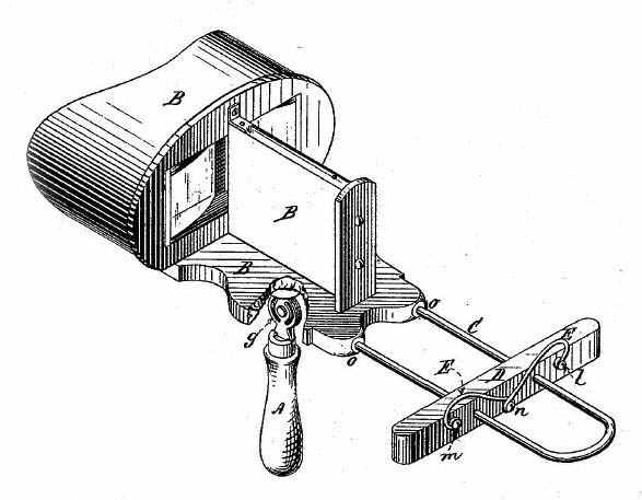
William and Frederick Langenheim introduced stereoscopic photography in America in 1854 and within four years, numerous local photographers and major publishers were creating scenes for a very enthusiastic public. Initially, most stereoscopic collectors were professional men who had returned from trips to Europe with groups of views. One of these men was poet and physician, Dr. Oliver Wendell Holmes, who was fascinated with the new phenomena and saw infinite possibilities for its uses. Holmes’s zeal for the stereoscope’s possibilities surpassed mere praise for the stunning representation of the visible world. Through the means of the photograph and the stereograph, he explained, form had become an intellectual entity-distinct from physical objects-in the same way that the printing press had liberated thought. Holmes recognized the need for a more affordable stereoscope and created a hand-held stereoscope from scraps of wood and showed his design to several people in Boston. Holmes eventually met Joseph L. Bates, who had a small business selling stereoscopes and views. Bates refined the Holmes design by adding the sliding focus stage with wire holders for the view. The stereoscope was a success and the lower cost brought stereoscopic photographs to the masses.
Early stereoscopic photographers referred to themselves as artists. Like painters, stereoscopic photographers were equally concerned with composition, a factor crucial to producing a fine stereoscopic image. Equally critical was a print with rich, even tones much like mixing paint on a palette. And like the first time one views a stunning painting, the experience of looking at a stereoscopic view was unmistakable:
“Everyone who views a good stereoscopic image is immediately enthralled. I have noted a level of excitement and involvement unmatched by two-dimensional visuals, other factors being equal. The strong emotional and esthetic reaction observed and reported by many artists throughout the stereoscopy’s 130-year history raises the interesting speculation that we may be imprinted with specific responses to fundamental or archetypal spatial stimuli in our visual world, in addition to many shapes, patterns and colors.” -Robert Silverman
As a twenty-first century American living in the digital age, I did not expect to be very taken with stereoviews. The contrary proved to be true-I was nothing short of enthralled. I didn’t just see the tallest structure in New York; I stood on the tallest structure and concur with Holmes reaction to stereoscopic photography: “Every conceivable object of nature and art will soon scale off its surface for us.”Every angle, steel wire, and cut stone of the bridge was there for me to experience. The Dennis Collection of stereoviews at the New York Public Library allowed to me feel as if I was witness to the construction.
Sources:
McCullough, David. The Great Bridge. New York: Simon & Schuster, 1972
Haw, Richard. The Brooklyn Bridge: a cultural history. New Brunswick: Rutgers University, 2005
Bowers, Brian, Wilson, Margaret. Sir Charles Wheatstone Frs 1802-1875 (I E E History of Technology Series). London: Institution of Electrical Engineer, 2001


 Jessie Tarbox Beals (1870-1942) was a pioneer for women, working as the first published female photojournalist in the United States. While working, she carried heavy camera equipment while donning the bulky women’s fashions of the late 19th and early 20th century. Beals later opened her own studio as a divorced, single mother.