Multimedia artist Faith Ringgold passed away on April 12, 2024. She was 93 years old and renowned for depicting the African American experience often using pictorial quilts.
During the 1960s and 1970s Ringgold played an instrumental role in the organization of protests against museums that had neglected the work of women and people of color. In 1971 she was a founder of the artist collective for Black women, Where We At. Ringgold was also an author and illustrator of children’s books. It is through one of her books that she first came to my attention.
During the early 1990’s my sister was working on her bachelor’s degree in childhood education and one day wanted to fervently show me one of the children’s books she was reading. It was Tar Beach. Set in the Harlem of 1939, it tells the story of Cassie who dreams of being free and going anywhere she wants. One day her wish comes true when the stars help her to fly across the New York City. I was immediately taken with the book because the George Washington Bridge was prominently featured. I grew up near that bridge and spent many magnificent summers biking and walking across. My sister knew of my love for the bridge. However, I was also intrigued to learn the book had started out as a story quilt.
Ringgold, in 1988, created a story quilt titled Woman on a Bridge #1 of 5: Tar Beach, which was part of a series, Women on a Bridge, that depicted women, “…actually flying; they are just free, totally. They take their liberation by confronting this huge masculine icon—the bridge.” A few weeks before my sister shared Tar Beach with me, I had serendipitously read Alice Walker’s short story, Everyday Use, for my American Literature class.
Everyday Use is set during the late 1960s or early 1970s in the rural south and tells the story of a family reunion where the characters contend with their opposing perspectives on their cultural roots and the meaning of heritage. Is heritage best represented by everyday use or by historical display of objects[1]? The story examines these ideas through quilts, an African American tradition that are a vibrant part of American history.
Enslaved women first created quilts communally out of a necessity to supplement their scarce bedding. Members of the Underground Railroad used quilts to send messages: quilts made with black cloth were hung to mark a safe house of refuge, while other quilts acted as maps, marking escape routes. Quilts also recorded family events such as births, weddings, and geographic locations. Meaningfully, quilting served as a creative outlet for the women to claim their identity and legacy during a time when literacy was illegal for them. I think this is exactly what Ringgold and Walker were connecting with in their own art. And Ringgold successfully does both of what Walker explored in her story: heritage through display and “everyday use.”
Tar Beach and Everyday Use will forever be linked for me: I can’t think of one without thinking of the other. I also can’t help but to also think about how both, whether through words or illustrations, tap into the importance and connection of the handmade and heritage.
In this increasingly exhaustive era of digitizing, monetizing, branding, and gentrifying, the cultivation and maintenance of heritage is becoming more difficult. Just last week I saw several stories about how some colonizing Americans moved to Mexico and are trying to suppress local customs. Similar things are happening in Puerto Rico, and be sure to read the chapter on Harlem in the book, Vanishing New York.
The transmission of customs from generation to generation are essential to any group’s identity as well as to foster heritage. For it to flourish, it must indeed be a part of “everyday use.”
Thank you, Faith Ringgold, for cultivating heritage and fostering my own imagination with your beautifully empathetic art. Enjoy your own flight among the stars over New York City.
“An Evolution of Expression.” National Museum of African American History and Culture, 17 Nov. 2023, nmaahc.si.edu/explore/stories/evolution-expression.
“Through the Folk Art of Quilting, Tracy Vaughn-Manly Works to Preserve Black American History and Culture.” Weinberg College News, 14 Feb. 2023, news.weinberg.northwestern.edu/2023/02/14/tracy-vaughn-manly-works-to-preserve-quilting-history-at-northwestern/.
Bryant, Marie Claire. “Underground Railroad Quilt Codes: What We Know, What We Believe, and What Inspires Us.” Smithsonian Center for Folklife and Cultural Heritage, 3 May 2019, folklife.si.edu/magazine/underground-railroad-quilt-codes.
[1] One of the first exhibitions at El Museo Del Barrio was The Art of Needlework which showcased the artistry of Puerto Rican women—the display of everyday use if you will. What started out as a local custom was then gentrified, monetized, and eventually abandoned with the advent of machinery. This exhibition happened about three years before Alice Walker published Everyday Use.
Today, July 30, 2023, is one of the worst days of my life.
My sweet Seven has crossed the rainbow bridge. I am only finding some comfort knowing that she is reunited with the love of her life, Rigatony, who passed away in 2016 at the age of 16 (pictured below). Seven (named after the Star Trek Voyager character) was a year old when I adopted her from the NYC ASPCA Adoption Center on July 2, 2005, and lived for 19 years. She was in pain, and while I have been here twice before, the decision to euthanize is never an easy one. She peacefully passed away in my arms. Logically, I know this was humane. Emotionally, my heart and soul are broken.
My home is not the same. I feel lost. This first dinner without her was difficult for me and Selina; I experienced a panic attack. Nine years ago, I wrote here on this blog how she helped me overcome a lifelong fear through love and I will be eternally grateful. As someone else once conveyed about our beloved furry children, their only flaw is that they live for a fraction of our lives. Indeed. I will forever miss my sweet Seven. Please be there to greet me in the afterlife as you did so many times when I returned home.
P.S.
I wanted to also share this Ted Talk about Pet loss and bereavement. Please share it as I think it can help many to understand their feelings. https://youtu.be/TkJGhQANjZo
Designing a logo requires significant thought and strategy. A museum logo design should not just convey an acronym, it should evoke a message. Positive and negative space is a classic design trick that plays a key role in conveying messages and could be mixed with typographic fonts to create a logo. Modern museum logos are focused on adapting modern perspectives. Vibrant, modern logos for museums usually focus more on shapes and silhouettes. Museum logos should incorporate an understated touch of the old and new.
The Asian Art Museum in San Francisco launched a new logo in 2011 that was created by Wolff Olins. The old logo, which was created in the early 1990s, took the form of a solid red square bearing the word “ASIA” in dropped-out white, bolstered by a stylized red “N.” The red block recalled the signature seal that appears at the margins of many East Asian painting and calligraphy scrolls (Kobayashi 2012). Tim Hallman, director of communications and business development, told the SFGATE.com (San Francisco Chronicle’s digital presence), that in place of the old logo, “we wanted something bold that didn’t suggest an institution just representing the past.” The current logo consists of an upside-down letter A. When the inverted “A” was presented, a board member’s spouse pointed that as a mathematical symbol an inverted “A” represents “for all.” “We decided we were on to something,” Hallman noted. (Baker 2012)
Here we have an early iteration of the NMAAHC’s logo (or a working logo) and the current logo. The working logo has quite a few problems: it is over complicated, too colorful, has poor spacing, and the two typefaces do not complement one another. Interestingly, some of those colors survived and can be seen in the NMAAHC’s current brand guide (National Museum of African American History & Culture n.d.). Meanwhile, the current logo (this is the horizontal iteration) is nothing short of excellent. Aside from highlighting the building’s distinction on the National Mall, it can stand alone and work without text and be instantly as recognizable as the Nike swoosh. Interestingly, they also retained the use of serif and sans-serif typefaces with the latter dominating the design. The museum has a long name and even its abbreviation is long (which, of course, cannot be helped). But note that from the working logo to the current one, they dropped the word “and” and substituted it with an ampersand. Time will tell if a catchy nickname emerges.
The Metropolitan Museum of Art is the largest art museum in the United States with two locations in New York City and is commonly known all over the world by its nickname, The Met. The museum decided to capitalize on this when they created a new logo 2013. The previous logo, a classically diagrammed M clearly influenced by western art, had been in use since 1971. One of the reasons for the new logo was to give the then three sites a unified image (at the time the locations included the main museum on 5th Avenue, The Met Breuer, devoted to modern art, which closed in 2020, and The Met Cloisters devoted to medieval art and located in upper Manhattan), not unlike what The Tate did with regards to creating a unifying visual identity for the Tate Britain, Tate Modern, Tate St. Ives, and Tate Liverpool. The logo, like the Asian Art Museum in San Francisco logo redesign in 2011, as well as The Tate redesign, was created by Wolff Olins.
Justin Davidson, New York magazine’s architecture critic called the logo a “graphic misfire” that “looks like a red double-decker bus that has stopped short, shoving the passengers into each other’s backs.” Davidson goes on to note: “You might think an art museum that attracted 6.3 million visitors last year might not worry much about coming off as too aloof. Or that those who feel intimidated by ceremonial staircases and neoclassical colonnades might not be soothed by a logo with stylized ax blades hanging off the E and T. Or that it might seem a little childish to grab back a nickname already embedded in the logo of another Met. (The designer Paula Scher broke the word Met / ropolitan before Opera specifically to highlight the shorthand.)” (Davidson 2016)
I wholeheartedly disagree with Davidson. First and foremost, The Met isn’t solely about western art. The old logo, which immediately recalls Leonardo da Vinci’s Vitruvian Man drawing, implies that. The new logo brilliantly combines calligraphical and sans serif typeface elements (the old and the new) that connects the past with the present as well as the future. Davidson also fails to realize that the original logo was created in a pre-digital world. To the right is a screen shot from my iPhone of an e-mail I recently received from The Met. One can see how easy it is to spot and pick out the museum’s logo in between the Xpand logo, which would be more legible at this size if they used a white background, and the Travelzoo logo, which is nearly illegible. One important thing about any modern logo is its need to be scalable—it should look great whether it is big or small and, most importantly, should be easy to read and stand out whether it is at the top of a letterhead or at the bottom of a 96-sheet billboard. Finally, I would like to note that if one went to the top search engines (Google, Yahoo, and Bing) and typed “The Met” the first thing that comes up is The Metropolitan Museum of Art and not The Metropolitan Opera, which is always the second listing.
Typeface Survey
In 1448, Johannes Gutenberg, a goldsmith living in Mainz, Germany, was experimenting with a mold with the goal of speeding up the process of putting ink on paper. Gutenberg’s invention, the printing press, fostered the modern world of science and industry. Printing took off in large part because Gutenberg could produce, using movable type, a book that looked as if it had been written by hand. (Sington 2020) This was possible because he was printing the Latin alphabet. The letters of the Latin alphabet are simple, block shapes and all the letters are clearly separate and can easily become blocks of metal to be printed (Shaw 2015). Had Gutenberg been trying to print a type of script, he might not have succeeded. Every modern innovation is built on the technology of putting words on a page. (Sington 2020)
Since the advent of the printing press, there would be variations and advances in printing that include etching, lithography, mimeograph, screen printing, phototypesetting, inkjet printing, and laser printing. With the arrival of desktop publishing, the words typeface and font became common and are often used interchangeably. On a technical level both words have distinct meanings. The word font comes from the Middle French word ‘fonte’, which means cast in metal. Printers like Gutenberg would cast complete sets of metal letters to make up a font. Fonts with a common design made up a typeface. In a box containing a specific font were two cases – one for capital letters and one for small letters (which is where upper and lower cases comes from). Blocks of text were assembled letter by letter to form a page layout, which was then rolled with ink and pressed onto paper to make prints. (Webster 2019) In modern terms, typeface describes a style and way of presenting text, while a font refers to variations of a typeface, such as size and weight. Helvetica is a typeface that has a complete set of characters with common design characteristics. However, it is made up of a whole collection of fonts, each in a specific weight, style, and size, with different levels of concentration as well as italic versions.
Typography is an essential element in graphic design, and therefore a significant part of branding. Typography represents the tone and values of a brand not unlike the way color represents a feeling. Typefaces can be classified into the following three groups: serifs, sans-serifs, and scripts. Generally, serif typefaces represent classical tradition, authoritativeness, and trustworthy. The Times New Roman font, originally designed in 1932 for The Times of London newspaper (Microsoft 2021), is a widely used example. Sans serif typefaces typically look clean, modern, and universal. Helvetica is widely used in signage because of its high legibility and simple feel (the exact one used in the New York City subway redesign example noted earlier in this paper). Script typefaces, designed to look like cursive handwriting, look more personal and are often associated with creativity.
Typefaces have changed and evolved over different periods of time, following trends, technology, and art movements. When thinking about typography and design, all typographic elements should consider visual arrangement, color contrast, the blank space, as well as sizes. Every typographic element impacts design on both the macro and micro level. In museums, most notably with exhibition labels, the legibility of copy is important. Museum labels are indeed subject to brand standards.
Good legibility is largely influenced by familiarity. There are many typefaces to choose from that offer excellent legibility for the body copy of museum labels. However, it should be noted that redesigning typefaces created for traditional methods of printing and then translated for computer bitmaps can change the aesthetics. The qualities of a good brand typeface are legibility, uniqueness, and being able to work for various platforms and mediums while conveying a distinct personality.
Choosing the right typeface can make a significant difference between a good and a great design. Even though most computers come with a library of typefaces, this isn’t always enough as a designer might be looking for a particular look and feel. There are several websites with massive libraries to browse through. These sites are broken into three types, giving you the option between open source / free, paid, or a subscription. Open source typography is easy to find and experiment with and are often the choice of startups and small businesses. Typography found on sites such as Google Fonts is web-friendly and consistent across all platforms and devices. The downside is that they are often generic and lacking in character and don’t add much to a brand. When you pay for typefaces, you are ensured a greater degree of flexibility and uniqueness of personality. Options are indeed more numerous, but licensing for these can be costly. The best way to truly make a statement and get a typeface that is a perfect reflection of the brand is to create one. Custom typography provides a unique visual language, but it can be quite expensive. Creating primary, secondary, and tertiary font types is also very time-consuming.
The Cooper Hewitt in New York City is the only museum in the United States devoted exclusively to design. Founded in 1897 by the Cooper/Hewitt family as part of the Cooper Union for the Advancement of the Science and Art, it became a part of the Smithsonian in 1967. In 2014, The Cooper Hewitt rebranded. Like The Met, part of their rebranding included adapting their shortened nickname “Cooper Hewitt” (previously known as Cooper-Hewitt, National Design Museum, Smithsonian Institution) The rebranding also included a tailor-made typeface known as “Cooper Hewitt.” Smithsonian Magazine noted that “…the new typeface is strong, simple and versatile, making it “clear for signage, compact for print” and optimized for digital media.” The Cooper Hewitt typeface is an open licensed font free for anyone to download, use, or modify on their own. (Stamp 2014)
Color Survey
Color is a significant factor in branding. Interestingly, color does not exist in the physical world, only light waves of various wavelengths that are received and distinguished within the eye and brain. Although humans can distinguish between numerous wavelengths, our color vocabulary is limited. (Smithsonian Libraries 2017) Color perception has long been the subject of experiments and discussions. Perception of color can change based on a person’s age, gender, personality, income, and other factors. Considering the factor of age as one example, the North Carolina State University Color Lab notes that “the human body undergoes change as it ages and this includes changes in the optical apparatus and pertinent sectors dealing with the construction of retinal image. Variations in the macular pigment in different eyes as we age also contribute to the overall color vision variability amongst humans.” (North Carolina State University Color Science Lab n.d.)
The psychology of color is a powerful tool in design and branding. According to a 2006 study, “Color is ubiquitous and is a source of information. People make up their minds within 90 seconds of their initial interactions with either people or products. About 62‐90 percent of the assessment is based on colors alone. So, prudent use of colors can contribute not only to differentiating products from competitors, but also to influencing moods and feelings – positively or negatively.” (Singh 2006) The Color Psychology Chart offers a brief look at twelve of the most used colors along with affecting guidelines, both positive and negative. (Ignyte Branding n.d.)
Adobe Marketo Engage analyzed the world’s top 100 brands to explore the most popular uses of colors. They found that blue was used in 33% of the top 100 brands. Red was used in 29% and black or greyscale was the third most popular choice with 28%. Finally, 13% used yellow or gold. They also noted that 95% of the top 100 brands only use one or two colors to maintain consistency by staying simple in their branding. (Solar 2018) As I noted earlier with the logo for the National Museum of African American History and Culture, the recognizable corona does not need the text to be effective.
The Craft Contemporary art museum (previously known as the Craft and Folk Art Museum) located in Los Angeles was established in 1975 to exhibit the work of underprivileged craftsmen and artists while promoting contemporary art made from local craft processes. The design firm, Siegel+Gale, discussed the name change: “The name Craft & Folk Art Museum was setting the wrong expectations. Together, the words “Craft” and “Folk” sounded ordinary and traditional, rather than rich and relevant. The name did little to pique the interest of visitors looking for a more contemporary museum experience. And it failed to highlight what makes the museum so unique: it functions as a platform for a diverse community of makers and as a space to both view and create art. The museum needed a more engaging introduction, one that appealed to a broader audience and worked to elevate craft in the contemporary art dialogue.” (Duong 2019)
As part of the overall rebranding, Siegel+Gale also redesigned the museum’s logo which is a simple sans-serif typeface with an edgy monogram. The simple, but consequential typeface was created to emphasize the letter C in the museum’s name. Note the orange color: as detailed in the Psychology of Color Chart, it has positive associations with the innovation, friendliness, and energy. Orange conveys the excitement of red, while concurrently conveying the warm aspects of yellow.
Siegel+Gale noted that the monogram that communicates, through the bold geometric shapes, a diverse community that believes in the distribution of contemporary art and culture. A bold, forward-looking triangle within the negative space was incorporated to represent progression and the pushing of boundaries.
Alexander, Edward P. , Mary Alexander, and Juilee Decker. 2017. Museums in Motion: An Introduction to The History and Functions of Museums. London: Rowman & Littlefield.
Beveridge, William I.B. 1957. The Art of Scientific Investigation . New York City: W.W. Norton & Company Inc.
Blattberg, Robert C., and Cynthia J. Broderick. 1992. “Marketing of Art Museums.” In The Economics of Art Museums, by Martin S. Feldstein, 327 – 346. Chicago: University of Chicago Press.
Bunch, Lonnie G. 2019. A Fool’s Errand: Creating the National Museum of African American History and Culture in the Age of Bush, Obama, and Trump. Washington, D.C.: Smithsonian Books.
Carr, David. 1999. “The Need for the Museum.” Museum News 31-57.
Kobayashi, Sachie. 2012. “Description of East Asian Seal Impressions as Metadata.” Journal of East Asian Libraries.
Mann, Jorrit. 2021. Dieter Rams: Ten Principles for Good Design. Munich: Prestel Art.
McCall, Vikki, and Clive Gray. 2014. “Museums and the ‘New Museology’: Theory, Practice and Organizational Change.” Museum Management and Curatorship 29 (1): 19-35.
Ross, Max. 2004. “Interpreting the New Museology.” Museum and Society (2): 84-103.
Schubert., Karsten. 2000. The Curator’s Egg : the Evolution of the Museum Concept from the French Revolution to the Present Day. L. London.: One-Off Press.
Shaw, Paul. 2015. The Eternal Letter: Two Millennia of the Classical Roman Capital (Codex Studies in Letterforms). Edited by Paul Shaw and Scott-Martin Kosofsky. Cambridge, Massachusetts: The MIT Press.
Singh, Satyendra. 2006. “Impact of color on marketing.” Mangement Decision (Emerald Group Publishing Limited) 44 (6): 783-789.
2020. A to Z: How Writing Changed the World. Directed by David Sington.
Smithsonian Institution Office of Policy & Analysis. 2001. Audience Building: Marketing Art Museums. Washington D.C.: Smithsonian Institution.
Part One of Two: Branding and Marketing the Museum
“Cultural institutions are essential for the survival of the human fabric and its patterns. They hold the remaining traces and artifacts of the interactions and processes of life; they capture the knowledge that follows these events.” – David Carr (Carr 1999)
Museums are social arenas where education, understanding, representation, and enrichment of cultures and the sciences happen. However, they did not start out that way. With origins in elitist collecting, often in the form of exoticism and cultural appropriation, the birth of the modern museum came from the French Revolution. Museums became symbols of the new French Republic and revolutionaries and politicians wanted to destroy all traces of the old regime while concurrently preserving French culture that was essentially dependent on the aristocrats and royals (Schubert. 2000.) This dichotomy still exists. Museums were supposed to be for the people; however, the aristocrats have never really left. What emerged was a challenge that has existed for decades: incorporating the old with the new via innovative methods of exhibiting collections (in France it was repurposed royal and religious structures). For a long time, museums largely drew scholars, artists, and the elite. We would see this in the United States as well.
Franz Boas, also known as the “father of American anthropology,” who conceived the first museum exhibition in the Northwest Hall of The American Museum of Natural to value indigenous cultures on their own terms and not in relation to Western cultures (American Museum of Natual History n.d.), wrote in 1907: “The value of the museum as a resort for popular entertainment must not be underrated, particularly in a large city, where every opportunity that is given to the people to employ their leisure time in healthy and stimulating surroundings should be developed, where every attraction that counteracts the influence of the saloon and of the race-track is of great social importance. If a museum is to serve this end, it must, first of all be entertaining, and try to instill by the kind of entertainment offered some useful stimulant.” (Alexander, Alexander and Decker 2017)
Since the 1970’s, museums have undergone fundamental changes stemming from evolving political viewpoints compelling museum professionals to shift their attention from collections towards visitors (Ross 2004). New Museology emerged in the 1980s and considered the role of museums in wider social and political processes, aiming to become more inclusive and accessible and placing visitors at the center of the experience (McCall and Gray 2014). Monica O. Montgomery, Cofounder and Strategic Director of the Museum Hue, notes in Museums in Motion: An Introduction to the History and Functions of Museums: “The practice of diversity is no longer solely the realm of curators and captains of industry; it’s incumbent upon all of us to foster change at every level. If a museum is a mirror and its audience are a monolith, then there’s an internal problem: diversity and inclusion isn’t being centered in the ethos of the institution.”
The Economics of Art Museums (Blattberg and Broderick 1992) noted in 1992 that in the late 1980s, because of the changing tax laws, the donation of artifacts declined (“The number of donated works in 1988 was approximately 37 percent of the 1986 level.”) as well as the new efficiency in the art market (art as a monetary asset). Based on this, museums would need to rely more heavily on sources of revenues such as membership fees, corporate gifts, attendance, and government subsidies to enhance their collections. This report also notes that “…museums have a social responsibility to broaden their target audience to include less well-educated viewers in order to justify government subsidies. Thus, museums are forced to reconcile opposing desires in determining their mission or objectives.”
Over the last 30 years museums have understood the importance of adopting different communication and marketing techniques. Museum marketing is unique because museums have a mission to, first and foremost, educate the public while concurrently building an audience and revenue. The Economics of Art Museums devoted a chapter to museum marketing and noted that back in 1992, there were problems. Specifically, the curatorial staff, who are the product designers by proxy, did little research to understand what the audience wanted. Instead, they designed exhibits which they feel the visitor should see. The marketing department was then tasked with trying to convince the public that they should see these exhibits. The book recommends that “Achieving a museum’s full potential in the marketplace depends on the integrated effort of all departments to produce and deliver the museum’s product.” (Blattberg and Broderick 1992)
The Association of Art Museum Directors annual salary survey of 1989 detailed that fewer than one-fifth of the member museums had a Director of Marketing (17%). The percentage nearly tripled by 1999 to 50% (Smithsonian Institution Office of Policy & Analysis 2001). Interestingly, if you compare the 2017 (Association of Art Museum Directors 2017) and 2021 Association of Art Museum Directors annual salary surveys (Association of Art Museum Directors 2021), there has been an increase in salary expenses: the Western region has seen quite the spike and the Midwest has also increased spending while Mountain Plains states have decreased spending. The Mid-Atlantic states continue to lead in salaries.
Branding and Marketing the Museum
“To many outside of the museum, hiring the architectural team to design the building was the most important decision I would make. I disagreed. Bringing on the designer who work closely with a large team of educators, curators, collection specialists, and project managers to produce the exhibitions upon which the reputation of the museum rested was the most significant and thorniest decision.”– Lonnie G. Bunch III (Bunch 2019)
The importance of graphic design in museums is more than just a simple placard: it is congruent with the overall branding and marketing. A brand is the idea or image people have in mind, both in a practical and emotional way, when thinking about specific products, services, or a museum. It is not just the physical features that create a brand but also the feelings that visitors develop towards the museum. Branding includes the creation of a logo, a tagline, social media, and marketing strategies while congruently considering accessibility and technology. The American Marketing Association defines branding as follows: “A brand is a name, term, design, symbol, or any other feature that identifies one seller’s goods or service as distinct from those of other sellers.” (American Marketing Association 2017)
In 2014 The Guardian (Jones 2014) reported that, “The people who run museums have, over the past 20 years, learned to love the word “brand” – it’s now seen as an essential tool for leadership.” The article also notes that institutions like the Met have always had a strong identity and reputation with clear expectations regarding what audiences will find. However, until recently, this tended to happen organically. Museums have been putting more thought into what they stand for and managing their identity deliberately.
Last year, Museum Next (Coates 2021) noted that a successful brand communicates the essence of the museum. When branding works, it can generate publicity and bring more visitors. A good branding strategy encompasses the typical facets such as the logo, but it also includes social media branding. Social media provides a great opportunity for institutions to talk directly to the public. When this is successful, museums have used a unifying tone of voice and message throughout their communications which ties in with their overarching brand identity. While branding and marketing go together, they are two separate concepts, with marketing campaigns heavily impacted by the brand. Branding is timeless, as we have seen with museums like The Met, while marketing is current as we see with museum blockbuster shows such as The Met’s Costume Institute annual show.
The Smithsonian Institution Office of Policy and Analysis defines museum marketing as identifying leisure-time recreation needs and wants of potential audiences, mostly unmet needs, as well as Identifying ways in which potential audiences can be informed about and attracted to museum experiences (Smithsonian Institution Office of Policy & Analysis 2001). The American Marketing Association defines marketing as follows: “Marketing is the activity, set of institutions, and processes for creating, communicating, delivering, and exchanging offerings that have value for customers, clients, partners, and society at large.” (American Marketing Association 2017)
Museum marketing doesn’t have to be costly, but it should certainly be creative. One excellent example was in 2014, when The Asian Art Museum in San Francisco made an announcement that it had “lost” its Chinese terracotta warrior and asked for help from its visitors and followers. Using Facebook, YouTube, and Google Maps, participants were asked to help the warrior make his way back to the museum. The museum also posted flyers that read: “LOST: Male, 2,122 years old, doesn’t speak English.” According to the San Francisco Business Times, the terracotta warriors campaign generated 15,000 new followers on Twitter and triple traffic to its website. The exhibition drew a record-breaking 238,000 visitors. “We know that the audience we want to reach is really connected to social media and technology,” said Ami Tseng, director of marketing for the Asian Art Museum. “We just had to figure out a way to reach them.” (Frojo 2014) I loved that this marketing campaign predated the popular game Pokémon Go by two years. The game uses mobile devices with GPS to locate, capture, train, and battle virtual creatures, called Pokémon, which appear as if they are in the player’s real-world location.
NEXT MONTH: Surveys of logos, typefaces, and color!
Alexander, Edward P. , Mary Alexander, and Juilee Decker. 2017. Museums in Motion: An Introduction to The History and Functions of Museums. London: Rowman & Littlefield.
Beveridge, William I.B. 1957. The Art of Scientific Investigation . New York City: W.W. Norton & Company Inc.
Blattberg, Robert C., and Cynthia J. Broderick. 1992. “Marketing of Art Museums.” In The Economics of Art Museums, by Martin S. Feldstein, 327 – 346. Chicago: University of Chicago Press.
Bunch, Lonnie G. 2019. A Fool’s Errand: Creating the National Museum of African American History and Culture in the Age of Bush, Obama, and Trump. Washington, D.C.: Smithsonian Books.
Carr, David. 1999. “The Need for the Museum.” Museum News 31-57.
Kobayashi, Sachie. 2012. “Description of East Asian Seal Impressions as Metadata.” Journal of East Asian Libraries.
Mann, Jorrit. 2021. Dieter Rams: Ten Principles for Good Design. Munich: Prestel Art.
McCall, Vikki, and Clive Gray. 2014. “Museums and the ‘New Museology’: Theory, Practice and Organizational Change.” Museum Management and Curatorship 29 (1): 19-35.
Ross, Max. 2004. “Interpreting the New Museology.” Museum and Society (2): 84-103.
Schubert., Karsten. 2000. The Curator’s Egg : the Evolution of the Museum Concept from the French Revolution to the Present Day. L. London.: One-Off Press.
Shaw, Paul. 2015. The Eternal Letter: Two Millennia of the Classical Roman Capital (Codex Studies in Letterforms). Edited by Paul Shaw and Scott-Martin Kosofsky. Cambridge, Massachusetts: The MIT Press.
Singh, Satyendra. 2006. “Impact of color on marketing.” Mangement Decision (Emerald Group Publishing Limited) 44 (6): 783-789.
2020. A to Z: How Writing Changed the World. Directed by David Sington.
Smithsonian Institution Office of Policy & Analysis. 2001. Audience Building: Marketing Art Museums. Washington D.C.: Smithsonian Institution.
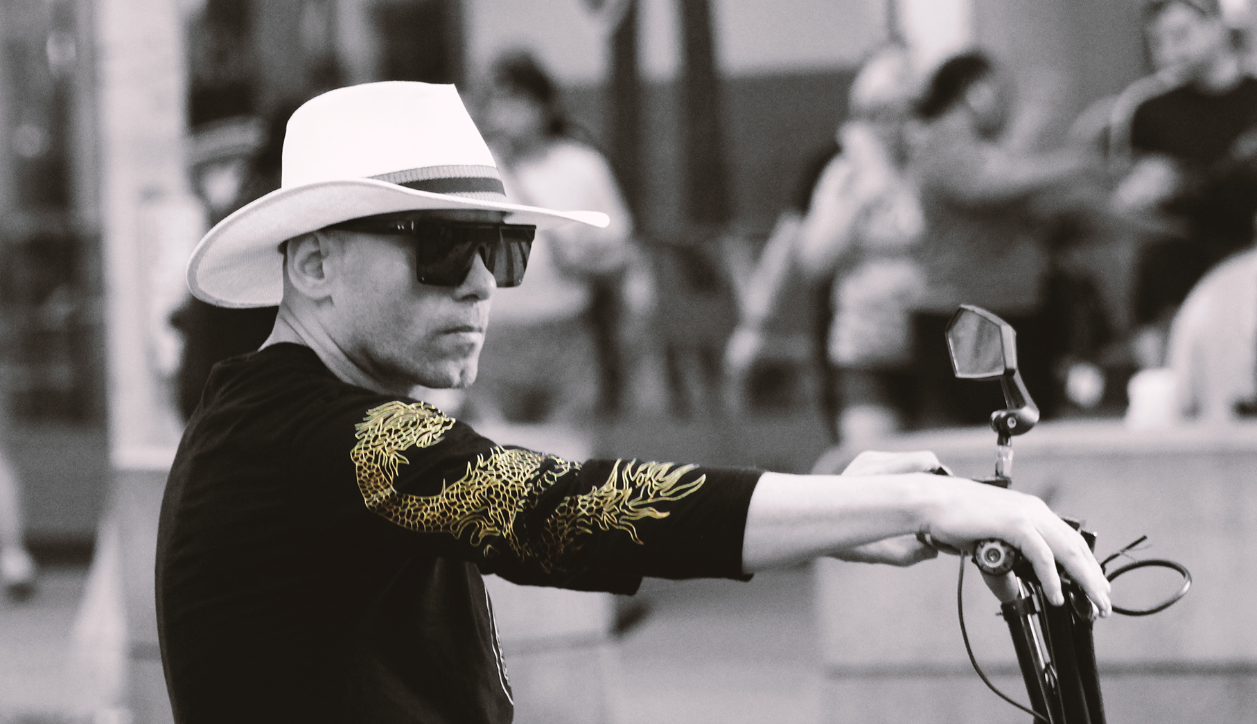
John Singer Sargent once said, “You can’t do sketches enough. Sketch everything and keep your curiosity fresh.” I am an avid people watcher and have published a book of photographs that explores this. As I note in my book, people watching in finding joy in people. I also love to people watch and sketch. Detailed here are some sketches I did last month while in a waiting room.
The last 25 years has seen corporations move into the Times Square area and make it one of the most touristy and congested places in New York City. Interestingly, many of the non-corporate businesses that once dominated the area have migrated to 8th Avenue. Despite the boutique hotels that have risen on 8th Avenue between 34th and 42nd Streets, the area has somehow resisted the gentrification. The Music Building is still there as well as a vintage liquor store, various bars, luggage stores, cheap souvenir stores, blue DVD stores, and New York eateries (I love that 2 Bros. Pizza opened a location in the area) beyond the usual fast food.
Since May of 2022, I have been spending some time in the area and my eye, as well as my camera by proxy, has been drawn to some of the fashions in that area. It is certainly not high-end fashion, but still interesting. It feels like New York City.
Governors Island is in New York Harbor. The National Park Service administers a small portion of the north end of the island as the Governors Island National Monument, including two former military fortifications named Fort Jay and Castle Williams. The Trust for Governors Island operates the rest of the island. The Lenape originally referred to it as Paggank or nut island” because of the various chestnut, hickory, and oak trees. Historians believe that the Lenape used the island for seasonal foraging and hunting.
I visited Governors Island during Memorial Day weekend 2022. Every time I visit, I love it even more. It is a wonderful oasis in the middle of a bustling city. This photo essay is actually my second one to feature the island. The first was of a Jazz Age Lawn Party. It probably won’t’ be my last.
Ferry LandingCurlsEasy ChairsSoft As An Easy ChairBridge BrooklynLinguaTransportationCastle Williams DetailParvus HortusRemorqueuse
“Like all my other films, Live Flesh is not easy to classify in terms of genre. All I know is that it is the most disquieting film I have made up to now, and the one that has caused the most unease. It is not a thriller, not a cop film, though there are policemen and gunshot and guilty men who are innocent. It is not a twilight western, although I would like to shoot one someday. It isn’t an erotic film either, although there are various explicit sex scenes, natural and didactic, and the story takes place in the field of bare carnal desire. Live Flesh is an intense drama, baroque and sensual that partakes both of the thriller and classic tragedies.”– Pedro Almodóvar on Carne trémula(Live Flesh) (Duncan 2017)
Portrayals of the Body by Almodóvar
Almodóvar, throughout his long career, has encouraged audiences to reconsider perfection and in fact, more often portrays the imperfect, going against the Hollywood standards of beauty. However, the actor playing Victor certainly conforms while the film embraces a typical storytelling troupe seen on stage and on film of the ordinary man whose life is turned around after encountering a femme fatale (think of the opera, Carmen). Almodóvar has also portrayed the human body in varied appearances that include the abused, the ill, the dead, and the disabled. He has explored disability in several films since Carne trémula(Live Flesh). Hable con ella(Talk to Her) follows two men who form an extraordinary friendship as they care for the two women they love who are both in comas which resulted from accidents. In Los abrazos rotos (Broken Embraces), we have a film director who loses his sight in a car accident. In Dolor y gloria (Pain and Glory), Almodóvar’s most biographical film, we have an ageing film director who is suffering from dysphagia and is rapidly declining physically and emotionally (interestingly, Almodóvar recently revealed that he is losing his hearing). While all the plots vary greatly for these films, the one thing they all have in common is that the characters became disabled. This is consistent with Franco’s mindset for the Jurisdiction of Labor legislation where safety regulations were aimed at preventing and addressing disability via workplace accidents, with no laws helping those born disabled. When I first saw the film in 1998, I found it to be a positive portrayal of a former police officer who is now an independent paraplegic and navigates the world with specially equipped cars and sexual inventiveness. My experienced eyes see it differently now because in the end Almodóvar falls into the same worn-out stereotypes of the disabled as incomplete human beings, especially when it comes to sexuality. Almodóvar notes: “When Elena spends the night screwing with Victor, at the end she caresses his legs, not his genitals, because what she misses most with her paralytic husband are his legs, full of life.” (Duncan 2017)
Catholic Guilt
Most of the Spanish population is Catholic. The Catholic Church’s close alliance with Franco caused many Catholics to be skeptical of the clergy and Almodóvar most notably explores this in La mala educación (Bad Education). The presence of Catholicism in Spain is culturally pervasive, and you see it in Almodóvar’s work. Guilt, particularly around sexuality, is a concept commonly associated with Catholics. (McMahon 2006) Some of Almodóvar’s portrayals of disability almost act like a religious reparation for sexual transgressions—the reverse of cure narratives and congruent with the religious model of disability, which views disability as a punishment inflicted upon an individual or family by God because of sin. In Los abrazos rotos (Broken Embraces), the film director who loses his sight in a car accident was committing an infidelity not unlike David and Clara in Carne trémula(Live Flesh). Was David punished for his sins? Was Elena atoning for her part in David’s disability? Is her devotion to charity part of this? Did Sancho and Clara die to atone for their respective sins? Why wasn’t Victor punished for sleeping with a married woman? Was it because he paid it forward via the time served in prison for a crime he didn’t commit? And while the film ends with Victor and Elena together, could she be repeating a cycle of atonement?
Part four: Disability in Spain today
Spain, in 2007, ratified the United Nations Convention on the Rights of Persons with Disabilities which requires governments to ensure that the physical environment, public services and most notably housing, are equally accessible to people with disabilities. (United Nations 2019) Spain passed a law in 2013 based on the premise that universal accessibility helps guarantee equal opportunities and treatment for people with disabilities. This legislation made homeowner associations responsible for ensuring their buildings are accessible to all people and set December 2017 as the deadline to eliminate architectural barriers. (Juridicas 2013) However, a March 2018 report by the UNESCO Chair on Housing and the Fundación Mutua de Propietarios found that only 0.6 percent of Spain’s 9.8 million residential buildings meet accessibility standards for those with physical disabilities. (UNESCO 2018)
The Confederación Española de Personas con Discapacidad Física y Orgánica (Spanish Confederation of People with Physical and Organic Disabilities) reported in 2019 that 100,000 people with physical disabilities in Spain remain trapped in their homes: of the 2.5 million people with physical disabilities living in Spain more than 1.8 million of them need help to be able to leave their homes. (Orgánica 2019) That same year the UN Committee on the Rights of Persons with Disabilities (https://bit.ly/3o1UBe2) similarly criticized Spain noting that “measures taken to ensure universal accessibility, particularly for private buildings, have been insufficient or ineffective.” It recommended the government take “all legislative and budgetary measures” necessary to fix the problem. This same report also noted that women with disabilities face multiple forms of discrimination due to their gender and disabilities and may also be at risk of gender-based violence and that public policies on disability and gender equality do not include measures to combat multiple and intersectional discrimination against women with disabilities. (United Nations 2019)
iHuman, a blog from the University of Sheffield that explores Covid, noted in 2020 two cases that looked at discrimination against the disabled in Spain (“Dis/ableism and the COVID-19 crisis: A partial view from Spain”). The first looked at barber shops, which were initially treated as essential services at the beginning of the lockdown and that this was received with some rage among many non-disabled people. The government explained that some people need assistance to maintain their basic hygiene. One politician (Isabel Díaz Ayuso, President of the Madrid region) declared, “I must protect them above all (…) I would rather they have dirty hair, and they stay healthy.” As the blog noted these people demonstrated, “…an incapacity to see beyond the independent, able-bodied…” The complaints were so laced with vitriol that the government switched gears and allowed hairdressing as an in-home service at the discretion of the provider. Worse than the haircuts, are some of the comments that autistic people and their parents have been hearing from balconies and windows in their neighborhoods, even after the Spanish government legally recognized their right to be in the street during the Covid lockdown: “Irresponsible! You put all of us in danger! Shame on you! Die!” The number of reported cases of harassment have driven Autismo España to create a platform to report discrimination. Some families have taken to wearing blue armbands to avoid being booed and insulted by neighbors for being outside. However, some organizations have accurately noted that the armband is a label that might also cause stigmatization. As iHuman notes:
“The demonisation of disabled people, the criminalisation of dependence and disability hate speech constitute serious dangers during the pandemic. Disabled people’s rights could be threatened by reactionary attitudes towards the basic practices they need to live liveable lives, including therapeutic walks among others. Being discriminated during the pandemic might represent a double nightmare to disabled people. We must do better.”
Indeed. We must do better.
Works Cited
Antonio, Sánchez Cazorla. 2010. “The Politics of Fear.” In Fear and Progress Ordinary Lives in Franco’s Spain, 1939-1975, by Sánchez Cazorla Antonio, 18-49. Chichester: Wiley-Blackwell.
Bogdan, Robert, and Taylor, Steven. 1987. “Toward a Sociology of Acceptance: The Other Side of the Study of Deviance.” Social Policy 34-39.
Del Cura, Mercedes, and José Martínez-Pérez. 2021. ““Childhood, Disability and Vocational Training in Franco’s Spain during the 1950s and Early 1960s.”.” History of Education Review 50 (2): 241–57.
Duncan, Paul. 2017. The Pedro Almodóvar Archives. Köln: Taschen.
Martínez-Pérez, José. 2017. “Work, Disability and Social Control: Occupational Medicine and Political Intervention in Franco’s Spain (1938-1965).” “Work, Disability and Social Control: Occupational Medicine and Political Intervention in Franco’s Spain (1938-1965).” 28 (4): 805-24.
McMahon, Christopher. 2006. “Fecundity and Almodóvar? Sexual Ethics and the Specter of Catholicism Catholicism.” Journal of Religion & Film 10 (2).
Reverte, Jorge M. 2010. “La Lista De Franco Para El Holocausto.” El País, June 20.
Seguin, Christopher Blow & Denis. 2019. The Dictator’s Playbook: Francisco Franco. Directed by Mark Stevenson. Produced by David, Kate Harrison, Michael Rosenfeld, and Matt Boo Brady.
Sotinel, Thomas. 2010. Masters of Cinema: Pedro Almodóvar. Paris: Phaidon Press.
UNESCO, Fundación Mutua de Propietarios. 2018. La accesibilidad de las viviendas en España. Madrid: Fundación Mutua de Propietarios / UNESCO.
United Nations. 2019. Convention on the Rights of Persons with Disabilities. New York: United Nations Convention on the Rights of Persons with Disabilities.
“I have never evoked Franco’s Spain before. I wrote the prologue for narrative and dramatic reasons but, really, there was also ‘something’ I needed to tell. Twenty years ago, I took my revenge on Franco by not acknowledging his existence, as if he never existed. Today I think I can’t forget that period, which is still relatively recent. That’s why there are two births in the film: the first is a city besieged by fear, and the second in a city full of people and happiness, that has forgotten fear. This optimistic ending in a story that has an obvious air of tragedy is like a breath of fresh air. – Pedro Almodóvar on Carne trémula(Live Flesh) (Duncan 2017)
The Shooting
The opening shot of the film is text declaring a state of emergency in Franco Spain and freedoms of speech, residence, and gathering have been suspended.
We next see text that reads, “Madrid, January of 1970.” A young prostitute named Isabel (Penelope Cruz, in her first collaboration with Almodóvar) gives birth on a public bus to a son she names Victor. Mother and son become minor celebrities, Victor is named an honorary citizen by the mayor of Madrid, and both are granted free lifetime bus passes by the transit company. The day Victor is born, Madrid is like an eerie ghost town, and it is pure chance (Almodóvar explores the motif of chance heavily in this film) that Isabel’s madame (Pilar Bardem, real life mother of Javier Bardem), was able to stop the bus when there was no other traffic or activity on the street.
The film jumps twenty years to 1990 and we see Victor (Liberto Rabal) working as a delivery person for Pizza Hut. Victor has fallen for a woman, Elena (Francesca Neri), with whom he had sex with a week ago in the bathroom stall of a nightclub. Elena conveys to him on the telephone that he has confused sex with love (odd since his mother is a prostitute and he will later reflect on how many “tricks she had to turn” to earn the inheritance she leaves him). Elena, who is hooked on drugs (addiction is an often-recurring motif in Almodóvar’s films), wants nothing to do with Victor, and when he shows up at her apartment, she carelessly waves a gun to scare him away. They get in into a scuffle and a shot is fired, and a neighbor calls the police. No one is affected by this gunshot.
The two police officers who respond, David (Javier Bardem) and Sancho (Jose Sancho), are friends and colleagues who are in the middle of their own crisis. Sancho is an abusive drunk and believes that his wife, Clara (Angela Molina, who will later play Cruz’s mother in Almodóvar’s 2009 film, Broken Embraces), is having an affair and suspects David of being her lover. When they arrive at Elena’s building, Sancho wants to storm the apartment while David is more sensible insisting that they follow procedure and call for back up. Sancho, the senior officer, refuses to do this. As Victor is peacefully leaving Elena’s apartment, Sancho storms the door and Victor, in a panic, impulsively picks up the gun and holds Elena hostage.
David tries to calmly defuse the situation and get Victor to drop his gun. Sancho repeatedly exacerbates the situation by threating Victor. David shockingly points his gun towards Sancho’s head and eventually gets Sancho and Victor to put down their guns. Victor lets Elena go free and David instructs her to flee. As Elena passes David, the film goes into slow motion: their eyes meet, and they have an intense moment of mutual attraction. Because David is momentarily distracted by Elena, Sancho lunges for Victor, and as they wrestle for the gun, it fires off.
Prison and Paralympics
The film jumps two years to 1992. Victor is in jail and while in the rec room watches a wheelchair basketball game featuring David who is now paralyzed from the gunshot. David is a star player in the 1992 Paralympics[1] and Elena, who is now his wife, watches, and cheers from the sidelines.
Victor is bitter watching this on television but has made the most of his time in prison, earning a degree via correspondence and exercising body and mind[2]. While Victor is in prison, his mother dies of cancer, but leaves him a house, (in a neighborhood amid what looks like an American style 1950s “slum” clearance program) and a small inheritance.
The film then jumps four years to 1996 and Victor is released from jail. As Victor is walking and relishing in his freedom, he sees a billboard for Champion athletic wear with David soaring in his wheelchair while playing basketball. Victor, under his breath, bitterly says, “Even when you lose, you win.” Two days later Victor visits his mother’s grave. By chance, David and Sancho are there for the funeral of Elena’s father. Victor boldly walks up to Elena and offers his condolences leaving her stunned. Before leaving the cemetery, Victor meets Sancho’s wife Clara (who looks a lot like a 1990’s version of Mrs. Robinson from The Graduate), also by chance, who has arrived late for the funeral. They leave together and she gives him a ride home. Victor and Clara establish a cautious relationship that will later evolve into an affair.
“Even when you lose, you win.”
Money and Virility
Elena, who comes from a wealthy family, is now off drugs and running an orphanage that houses several children with Down Syndrome. The orphanage is friendly and inviting, but humble. We also see Elena and David in their expansive and expensive apartment equipped with its own basketball court and wheelchair lifts. This stands in stark contrast to the orphanage where we see a scene depicting one of the workers asking for her salary (“I have not been paid in two months”) and her supervisor conveying that they still have not gotten funds from the government. The message here is crystal clear: money makes disability easier.
We next see Elena helping David with a bath. It turns into a sexual encounter, and we see that David is paralyzed from the waist down as he is only able to perform oral sex on Elena. Curiously, just after she climaxes, she chooses that very moment to tell David that Victor was at the cemetery. Was she sexually stimulated by virile Victor?
While David may not be able to sexually perform completely in bed, he is not about to be bested by Victor. After Elena’s revelation, he later barges into Victor’s house and warns him not to go near his wife. Victor challenges him, but David punches him below the belt (in the area where he cannot perform). Before they could get into a real brawl, they momentarily put their differences aside when they both happen to catch and comment on a key moment in a soccer match on television and briefly share a chuckle silently conveying that they could have been friends under different circumstances. David then composes himself and sternly warns Victor to stay away from Elena. Victor then taunts him by dropping to the floor and doing clapping pushups, showing off his sculpted physique.
A visual motif that is seen often in Almodóvar’s films is macro photography, where he focuses the lens very closely on details. For example, in Mujeres al borde de un ataque de nervios(Women on the Verge), we see the inner workings of a film projector; in Todo sobre mi madre(All About My Mother), there is an EKG machine and macro shots of the paper feed; in Los abrazos rotos (Broken Embraces), we see the leading man using a computer that reads to the blind. In Carne trémula(Live Flesh), we see David, after leaving Victor’s house, go to his car, which is specially equipped to be completely driven with his hands (again, money makes disability easier as he does not have to rely on public transportation), and go through the motions of getting into the car and then dismantling his wheelchair. It is a lot of work and a lot of details and Almodóvar makes certain that the audience knows it. David will later convey how he now must constantly look down to make sure that he does not get any dog feces on wheels. After David goes through the ritual of getting into his car, he sees Clara arriving and watches them from a distance. We later see Clara talking with Victor agreeing to teach him how to make love while concurrently showering him with gifts and affection. David begins to regularly spy on them and secretly photographs their rendezvous (a detail Almodóvar missed here was having David use a telephoto lens—instead his lens looks like a wide angle).
Revelations and Truths
Victor starts to volunteer at the orphanage Elena runs. He applies when she is out of the office and the credentials he earned in prison, qualify him for the position. He works well with the children and the staff appreciate this as well as his many other technical skills, such as basic plumbing. When Elena discovers that he is there, she objects but cannot give a sound argument against Victor working there. David continues to follow Victor (both are deft stalkers) and discovers that he works at the orphanage. He confronts Victor again, and Victor denies responsibility for firing the shot that disabled him. Victor then demonstrates how Sancho made him squeeze the trigger because Sancho knew David was having an affair with Clara (Victor found this out during a rendezvous with Clara).
David later conveys to Elena, while they are smoking marijuana[3], what Victor said, admitting that he was indeed having an affair with Clara. Elena is appalled, but still plans to leave the orphanage to get away from Victor. The following day, Victor tells Elena that his original plan of revenge was to become the world’s greatest lover, make passionate love to Elena, and then abandon her. But he changes his mind because he now loves her too much. After this, Victor breaks up with Clara. Distraught, she nearly sets Victor’s home on fire while cooking a meal. The image is quite powerful: Clara is in hell: no more Victor and she is stuck with the abusive Sancho.
Later, while Victor is working the overnight shift at the orphanage, Elena arrives to remove her belongings from the office and offers Victor a night of passion on the condition he never contact her again. Their night of love making is lengthy and in blunt contrast to the earlier hasty scene with Elena and David in the bathtub. As dawn breaks in Madrid, Elena cries realizing she is in love with Victor.
David returns from a trip in Seville that morning and Elena then tells him about her infidelity. She also conveys that she will remain his wife because he needs her more than Victor does. Bogdan and Taylor note that an accepting relationship is one between a person with a deviant attribute and another person, which is of long duration and characterized by closeness and affection and in which the deviant attribute does not have a stigmatizing, or morally discrediting, character. (Bogdan 1987) Elena’s motives for wanting to stay with David are curious. In fact, I wish the film had explored how they came together. We see that moment of intense attraction the night that David was shot, but I have always wondered how their relationship evolved. Does Elena really love David? Or was she with him out of guilt because what happened was a result of her drug use? Bogdan and Taylor noted that typical people who are in caring relationships with people who are different de-emphasize the negative aspects of the person and stress the positive. Elena seemed to be doing this until she learned the truth about David and Clara.
The Fatal Shots
Even though Elena has conveyed that she will stay with David, he is still hell bent on avenging himself against Victor. Meanwhile, Clara has decided to leave Sancho. He confronts her, but she shoots him with his own gun and escapes. David later arrives and helps Sancho clean his bullet wound before showing him the photographs he had been taking of Victor and Clara. We then cut to Clara writing a passionate farewell letter to Victor. As she is writing it, Sancho and David arrive. As Sancho pounds on the door, she details the play by play in the letter she is writing. She finishes and gets up to meet Sancho at the door and they have one final confrontation at gunpoint and fire at each other. Clara is killed and Sancho is wounded. Sancho unable to live without her, kills himself. Here Almodóvar brilliantly recreates the suicide scene in Hitchcock’s Spellbound[4].
The film jumps several months to the Christmas season and in a voiceover, David reads a letter written to Elena from Miami, where he is spending Christmas with friends: he apologizes for the way everything turned out. At the orphanage, we see Victor working on an elaborate Christmas decoration when he is suddenly interrupted by a pregnant Elena who is going into labor. On the way to the hospital, she and Victor get stuck in a traffic jam. Victor reflects on the circumstances of his own birth 26 years earlier and tells his unborn child that the Spanish people no longer live with fear as they did on the day he was born. The film comes full circle and concurrently celebrates Spain’s journey from the repression of Franco to the open society of today (though lately, in 2021, I have seen that as in the United States and Brazil, extreme conservatism in Spain is trying to make a comeback).
Next month we will conclude with parts three and four.
Antonio, Sánchez Cazorla. 2010. “The Politics of Fear.” In Fear and Progress Ordinary Lives in Franco’s Spain, 1939-1975, by Sánchez Cazorla Antonio, 18-49. Chichester: Wiley-Blackwell.
Bogdan, Robert, and Taylor, Steven. 1987. “Toward a Sociology of Acceptance: The Other Side of the Study of Deviance.” Social Policy 34-39.
Del Cura, Mercedes, and José Martínez-Pérez. 2021. ““Childhood, Disability and Vocational Training in Franco’s Spain during the 1950s and Early 1960s.”.” History of Education Review 50 (2): 241–57.
Duncan, Paul. 2017. The Pedro Almodóvar Archives. Köln: Taschen.
Martínez-Pérez, José. 2017. “Work, Disability and Social Control: Occupational Medicine and Political Intervention in Franco’s Spain (1938-1965).” “Work, Disability and Social Control: Occupational Medicine and Political Intervention in Franco’s Spain (1938-1965).” 28 (4): 805-24.
McMahon, Christopher. 2006. “Fecundity and Almodóvar? Sexual Ethics and the Specter of Catholicism Catholicism.” Journal of Religion & Film 10 (2).
Reverte, Jorge M. 2010. “La Lista De Franco Para El Holocausto.” El País, June 20.
Seguin, Christopher Blow & Denis. 2019. The Dictator’s Playbook: Francisco Franco. Directed by Mark Stevenson. Produced by David, Kate Harrison, Michael Rosenfeld, and Matt Boo Brady.
Sotinel, Thomas. 2010. Masters of Cinema: Pedro Almodóvar. Paris: Phaidon Press.
UNESCO, Fundación Mutua de Propietarios. 2018. La accesibilidad de las viviendas en España. Madrid: Fundación Mutua de Propietarios / UNESCO.
United Nations. 2019. Convention on the Rights of Persons with Disabilities. New York: United Nations Convention on the Rights of Persons with Disabilities.
[1] Disabled sports in Spain have a long history. In 1917 there were sporting events for the deaf. However, because of the unrest in Spanish society during the 1930’s due to the civil war and Franco’s subsequent terror, matters regarding disabled sports were quiet until the 1950s when the Spanish Red Cross organized disabled sports opportunities in the country, that included the first Olimpiadas de la Esperanza (Olympics of Hope) held in Tarragona. Spain competed at its first Paralympic Games in 1968. ONCE (Organización Nacional de Ciegos Españoles), in 1986, became the official organization for organizing Spanish representation in international blind sporting competitions. (Malaga n.d.) Here, I considered readings regarding adjustment talk and couldn’t quite get it to jibe because the Spanish language is more straightforward and not as nuanced as English in that the Spanish language has far fewer homonyms than English.
[2] Based on Almodóvar’s depictions of prison, the Spanish penal system appears to embrace humane rehabilitation: one scene in Hable con ella (Talk to Her), a guard notes that they don’t use the word inmate but instead use the word intern.
[3] In Spain, the sale and importation of any quantity of cannabis is a criminal offence, punishable by jail time. The purchase, possession, and consumption of cannabis in a public place constitutes a misdemeanor punishable by a fine and confiscation. Consumption and cultivation by adults in a private space is legal, the latter due to a legal vacuum and provided that it is shown to be for one’s own consumption. (I Wanna Grow Blog 2018)
[4] Almodóvar had previously used musical cues from Psycho and Vertigo in Pepi, Luci, Bom y otras chicas del montón and used other Hitchcock motifs in his film as well as professing in interviews his admiration for Hitchcock.